

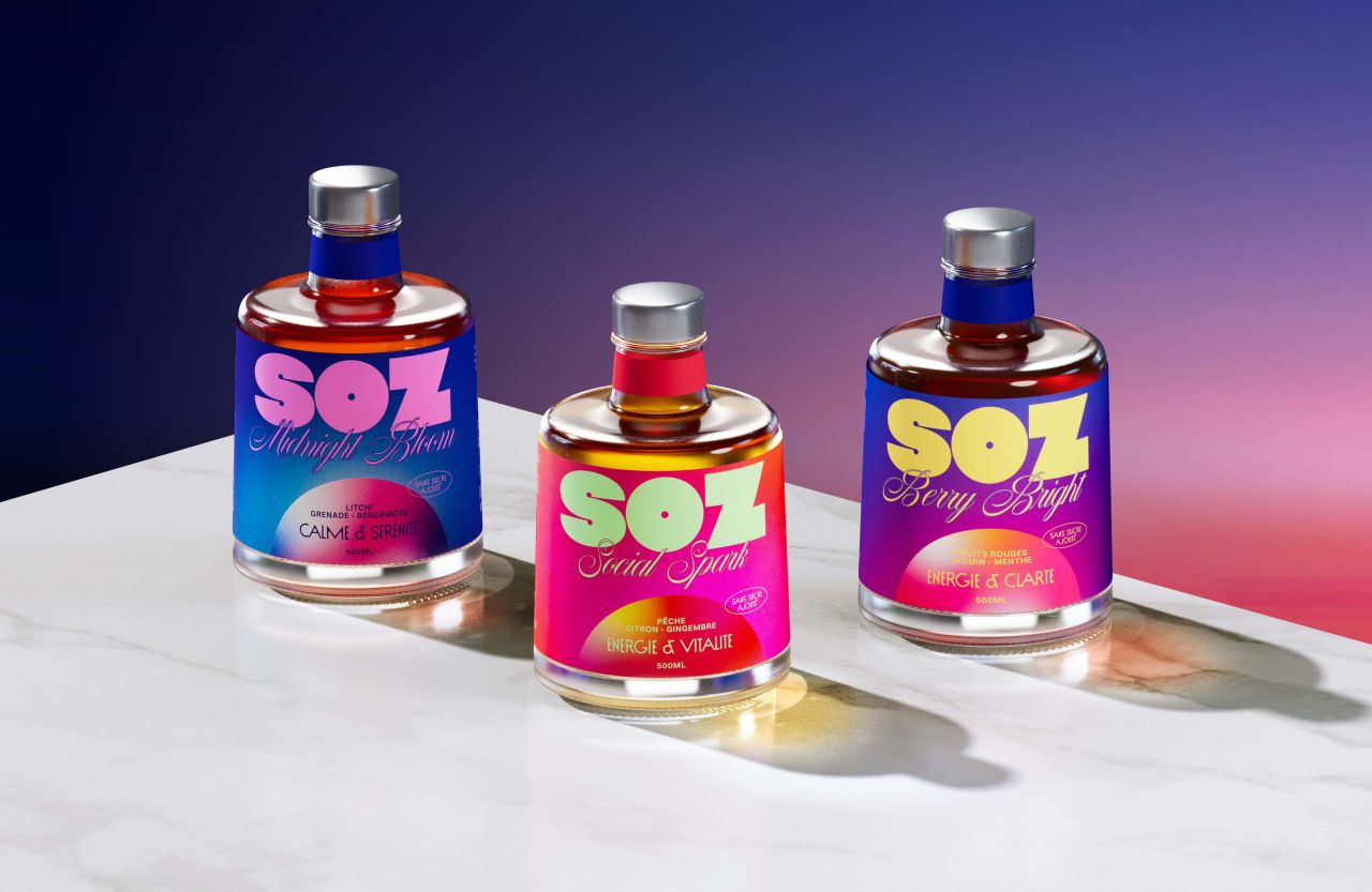
Daniela Barrio has developed SOZ as a vibrant mocktail brand that fuses the energy of nightlife with contemporary wellness culture. With bold colour clashes, expressive typography, and flexible packaging designed for both daytime refreshment and late-night vitality, SOZ delivers a fresh, dynamic identity that commands instant shelf impact.
SOZ emerges as a striking new entrant in the beverage landscape, carving out a space where wellness meets the thrill of nightlife. The brand’s design language is unapologetically bold, leaning into risk-taking aesthetics that combine intense colour combinations with high-contrast typographic systems. Expressive layouts amplify the sense of dynamism, ensuring the identity feels alive and constantly in motion.


At the heart of SOZ’s appeal is its packaging system, crafted to be intuitive and flexible. This adaptability allows the brand to seamlessly code different consumption moments, whether positioning itself as a refreshing daytime choice or as a source of late-night energy. Such versatility reflects the evolving consumer demand for beverages that fit multiple lifestyles and occasions.
Freshness is communicated through a palette of highly saturated, modern colours that feel vibrant and current. These hues create immediate visual impact, ensuring SOZ stands out in crowded retail environments while signalling its contemporary relevance. The result is a brand that not only captures attention but also embodies the cultural shift towards mindful indulgence—where wellness and social energy coexist.
Daniela Barrio’s creation positions SOZ as more than a mocktail; it is a statement of modern identity, designed to resonate with consumers who seek both vitality and style in their beverage choices.
Discover more from Creative Brands Mag
Subscribe to get the latest posts sent to your email.


Leave a comment