


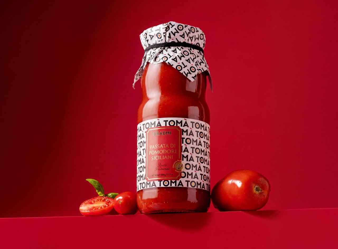
Rosario Lo Iacono Design has shaped TOMÀ, a tomato sauce brand built on linguistic insight and visual rhythm. The name reads as “tomato” when repeated, while in Sicilian dialect “tò mà” means “your mum”. This duality informs packaging that balances contemporary impact with authentic, homemade cues.
TOMÀ enters the tomato sauce category with a distinctive approach that places language at the heart of its identity. The brand name itself carries dual meaning: repeated, it naturally spells “tomato”, making the category instantly recognisable; in Sicilian dialect, “tò mà” translates to “your mum”, evoking the warmth of homemade cooking.
This linguistic play translates into two complementary design directions. The logotype becomes a repeatable visual system, forming rhythmic patterns that subtly spell “tomato” and enhance shelf impact. At the same time, the maternal reference is reinterpreted through a bold character: a grandmother styled in a vibrant Sicilian shirt, portrayed with confidence and modern flair. She becomes a “pop grandmother”, symbolising authenticity while speaking to contemporary audiences.
The packaging design balances rhythm and reassurance. The repeated logotype creates a dynamic background pattern, conveying modernity and memorability, while the central label adopts a more composed, classical layout that structures information and builds trust. This interplay of impact and familiarity ensures TOMÀ stands out while remaining approachable.
A key detail is the accent mark, reimagined as a brushstroke of sauce. This transforms a typographic element into a sensory cue, connecting directly to the product’s texture and essence. It is a subtle yet powerful reminder of the sauce’s homemade quality.
In a category often dominated by nostalgic codes and traditional imagery, TOMÀ takes a fresh, contemporary route. By using language as a design driver, it communicates authenticity without clichés, relying instead on rhythm, simplicity, and cultural resonance. The result is packaging that is both striking and meaningful, positioning TOMÀ as a brand that blends modern design with the essence of home cooking.
Discover more from Creative Brands Mag
Subscribe to get the latest posts sent to your email.










Leave a comment