

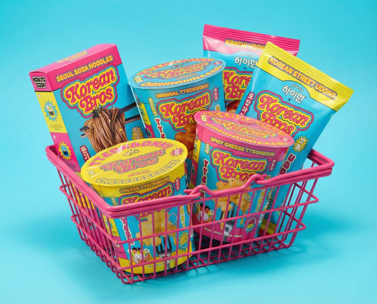
Truffl’s branding for Korean Bros reimagines Korean American food packaging with bold humour, neon palettes, and satirical storytelling. Centred on fictional brothers Dok and James, the brand fuses meme culture with Korean heritage, creating a disruptive identity that dominates shelves and digital spaces while celebrating flavour, comedy, and cultural audacity.
Los Angeles-based branding agency Truffl has created a riotous, comedy-driven identity for Korean Bros, a Korean American CPG food brand determined to make its packaging and storytelling as audacious as its flavours. Built around fictional brothers Dok and James, the brand thrives on satire, meme culture, and unapologetic boldness.
From bubble-lettered logotypes and neon palettes to hand-drawn illustrations of chopsticks, dumplings, and flames, every detail is designed to dominate shelves and disrupt the natural food aisle’s muted tones. The humour is not an accessory but the brand itself — a confrontational, comedic voice that insists bland food has no place in modern eating.
Packaging extends the narrative with dripping food photography, satirical founder portraits, and playful comparisons to American staples — tteokbokki as “Korean Mac and Cheese.” Korean language translations add cultural credibility, while the “Bro Origin” story and sticker systems ensure each SKU feels distinct yet cohesive.
Online, Truffl’s digital experience amplifies the irreverence: satirical reviews, a “Bro Dictionary,” and even a “Bro Face Generator” that lets fans join the movement. Korean Bros is less a food brand than a cultural performance, one that translates the energy of Korean flavour into a universe of comedy, colour, and conviction.
Discover more from Creative Brands Mag
Subscribe to get the latest posts sent to your email.


Leave a comment