


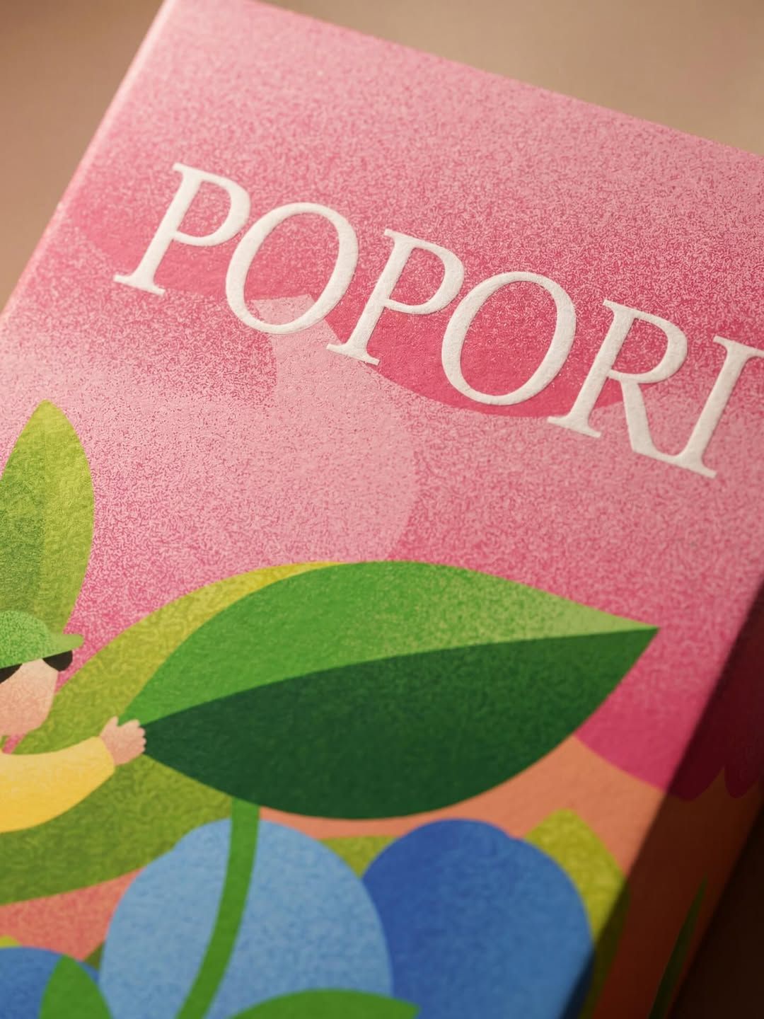
ARTSBY EMDE has unveiled a packaging design for Popori natural soda that turns the everyday beverage into a playful visual experience. The design combines whimsical illustrations with soft pastel hues, creating a joyful identity that feels both inviting and imaginative. It is a packaging concept that does more than simply contain a drink; it tells a story.
The illustrations evoke a world of nature and fantasy, where flora and fauna intermingle with dreamlike characters. This narrative quality transforms the pack into a miniature canvas of storytelling, encouraging consumers to pause and explore the details before taking a sip. Each element is carefully crafted to spark curiosity, making the soda feel like an entry point into a larger imaginative universe.


The pastel colour palette reinforces this sense of lightness and joy. Gentle pinks, blues and greens soften the overall aesthetic, ensuring the design feels approachable and warm. Rather than relying on bold or aggressive branding cues, ARTSBY EMDE has chosen subtlety and charm, aligning the product with a lifestyle that values creativity and natural delight.
By embedding character and narrative into the packaging, the design elevates Popori beyond the conventions of the soda category. It positions the drink not just as a refreshment but as an experience, one that resonates with consumers seeking authenticity and emotional connection. The pack becomes a conversation starter, a piece of design that reflects the brand’s ethos of blending nature with imagination.
This approach underscores the growing importance of storytelling in contemporary packaging. As consumers increasingly look for products that reflect their values and personalities, design studios like ARTSBY EMDE are responding with identities that go beyond surface appeal. Popori’s packaging demonstrates how illustration, colour and narrative can combine to create a brand world that is both distinctive and memorable.
In a crowded market, where soda brands often compete through flavour cues or bold graphics, ARTSBY EMDE’s work for Popori stands out by offering something gentler yet more engaging. It is a reminder that packaging can be more than functional—it can be a joyful invitation to step into a world of imagination.
Discover more from Creative Brands Mag
Subscribe to get the latest posts sent to your email.










Leave a comment