

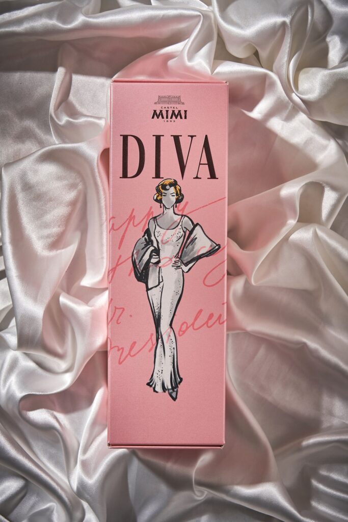
The Diva collection created for Castel Mimi reimagines premium sparkling wine packaging by placing the gift box at the centre of the experience. Inspired by iconic women such as Coco Chanel, Audrey Hepburn, and Jacqueline Kennedy Onassis, the design transforms wine presentation into storytelling and collectible artistry.
In the increasingly competitive world of premium beverages, presentation often shapes the first impression long before the product itself is tasted. The Diva collection created for Castel Mimi represents a deliberate shift in how sparkling wine communicates value, particularly in the context of gifting, by turning the packaging into the central narrative of the product.
Traditionally, wine branding has prioritised the bottle: labels, glass shapes, and cork finishes typically carry the weight of visual identity. Diva reverses that hierarchy. Here, the gift box becomes the primary storyteller, crafted to capture attention and convey emotion before the bottle is even revealed. The concept acknowledges a familiar social ritual—many celebratory purchases are first experienced visually, as gifts exchanged during birthdays, weddings, corporate occasions, or festive gatherings. In such moments, the impact of the object often precedes the experience of taste.
The design philosophy behind Diva centres on the idea that packaging can create an emotional connection. Rather than treating the box as a protective container, the designers approached it as a collectible object that defines the entire encounter with the wine. Each box is intended to stand on its own as a piece of design, reinforcing the notion that luxury in gifting lies as much in presentation as in the product itself.
The collection draws creative inspiration from iconic women whose personal style reshaped the concept of elegance in the twentieth century. Figures such as Coco Chanel, Audrey Hepburn, and Jacqueline Kennedy Onassis serve not as literal visual references but as conceptual anchors for the project. Their influence is interpreted through qualities such as confidence, restraint, individuality and timeless grace.
Instead of reproducing historical imagery or vintage aesthetics, the Diva collection translates these qualities into a contemporary graphic language. Stylised illustrations introduce character while remaining refined and adaptable across global markets. The aim is to evoke personality rather than nostalgia, ensuring the design resonates with modern consumers who value storytelling and authenticity.
This balance between character and refinement is visible across the range of boxes. Each design features carefully balanced typography, fashion-inspired silhouettes and distinctive colour palettes. Together they form a coherent visual family, yet each variation expresses a unique emotional tone. Some versions convey bold confidence through strong contrasts, while others suggest quiet sophistication through softer palettes and elegant lines.
The designers intentionally avoided repetition. Instead of identical packaging differentiated only by small colour changes, each Diva box carries its own personality while maintaining a recognisable identity. This strategy enhances shelf presence and ensures that the collection remains visually engaging when displayed together in retail environments.
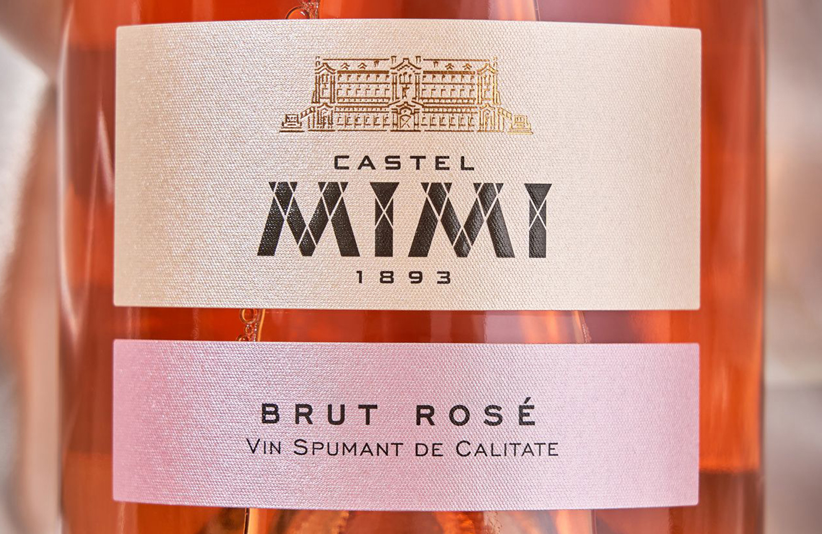
To maintain this hierarchy of visual storytelling, the bottle itself adopts a deliberately minimalist aesthetic. Clean labelling, restrained typography and subtle detailing prevent the glass from competing with the packaging. Rather than overshadowing the box, the bottle complements it quietly, creating a balanced relationship between the two elements.
This approach reflects a broader shift in luxury branding where understatement can often convey sophistication more effectively than excess decoration. By simplifying the bottle, the designers ensured that the dramatic first impression remains with the box, while the wine inside completes the experience with elegance.
The result is a product that moves beyond the traditional boundaries of sparkling wine branding. Diva becomes an object designed for celebration and gesture, where the act of giving is as significant as the act of drinking. The packaging communicates identity, mood and occasion, transforming the purchase into a narrative moment rather than a simple transaction.
Such thinking aligns with wider trends in premium consumer goods, where storytelling and emotional resonance increasingly influence purchasing decisions. In the gifting market particularly, buyers often look for items that carry symbolic meaning, reflecting thoughtfulness and style. By turning packaging into the central design element, Diva taps directly into this cultural shift.
For collectors and design enthusiasts, the boxes also offer an additional layer of appeal. Their illustrated characters, distinctive palettes and fashion-inspired aesthetics allow them to function as keepsakes long after the wine has been opened. This collectible dimension reinforces the idea that the product exists not just as a beverage but as a curated experience.
Ultimately, the Diva collection demonstrates how design can redefine expectations within even the most established categories. By elevating the gift box into a storytelling medium, the project challenges conventional assumptions about where value resides in wine branding.
In doing so, it positions Diva not simply as another sparkling wine label but as a celebration of elegance, personality and presentation. The result is an object that invites admiration before the cork is ever popped—where design, emotion and celebration converge to transform a bottle of wine into a memorable cultural gesture.
Discover more from Creative Brands Mag
Subscribe to get the latest posts sent to your email.


Leave a comment