

Three years after its unveiling, Air India’s ‘Vista’ identity has come to define its transformation under the Tata Group. Designed by FutureBrand, the rebrand has evolved from a visual overhaul into a strategic asset, signalling India’s global ambitions while reinforcing the airline’s renewed premium positioning.
When Air India first introduced its new brand identity in August 2023, it was framed as the beginning of a long-term transformation. Now, in 2026, that rebrand has matured into something far more significant: a visible and recognisable marker of the airline’s resurgence on the global stage.
Designed by FutureBrand’s London and Mumbai teams, the identity—anchored by “The Vista” logo—was conceived as a symbol of forward movement and possibility. Three years on, that symbolism has been tested in the real world, as Air India has steadily rolled out its new look across an expanding fleet, upgraded cabins and a rapidly evolving customer experience.
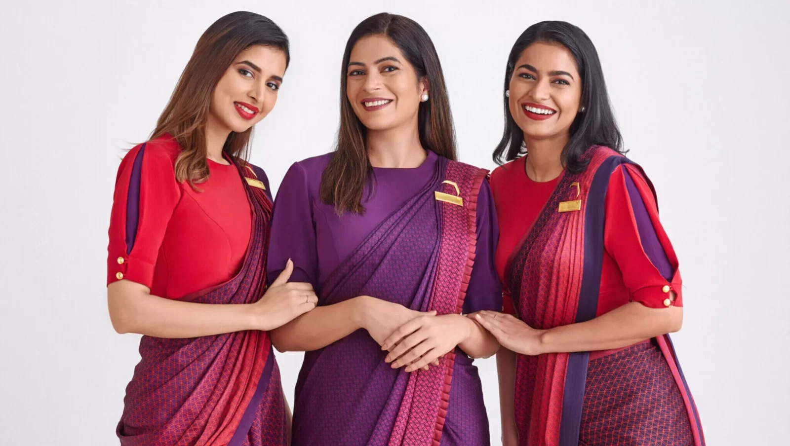
The Vista, inspired by the airline’s historic window motif, has become synonymous with this new chapter. What began as a design reinterpretation is now widely recognised as a visual shorthand for Air India’s ambitions. Its angular, gold-framed form—representing a “window of possibilities”—has taken on deeper meaning in 2026, as the airline continues to open new routes, strengthen international partnerships and position itself as a serious global competitor.
At the time of the launch, Air India described the identity as embodying “limitless possibilities” and a “bold, confident outlook”. In 2026, those words resonate more tangibly. The airline’s ongoing fleet modernisation, including the induction of next-generation aircraft, has ensured that the new livery—rich in deep red, aubergine and gold—has become a familiar sight at major airports worldwide. The visual consistency across aircraft, lounges and digital platforms has reinforced brand recall, turning design into a strategic differentiator.
Campbell Wilson, Chief Executive Officer and Managing Director, had initially positioned the rebrand as a reflection of ambition, calling it “bold, confident, and vibrant, but also warm and deeply rooted”. That duality remains central in 2026. As Air India continues to refine its premium offerings, the brand’s emphasis on warmth—expressed through its visual language and service ethos—has played a crucial role in reshaping passenger perception.
The bespoke Air India Sans typeface, introduced as part of the rebrand, has also proven its value over time. Designed to communicate “confidence with warmth”, it has become a unifying element across communications, from in-flight materials to digital interfaces. In an era where brand consistency is critical, such details have contributed to a more cohesive and contemporary identity.
For FutureBrand, the project was always about more than aesthetics. Jon Tipple, Global Chief Strategy Officer, described it as “one of the most significant airline rebrands of the decade”, aimed at creating an “iconic, standout brand design” that reflects both scale and aspiration. Looking back from 2026, that ambition appears well-founded. The identity has not only endured but grown in relevance, adapting seamlessly as the airline’s transformation has unfolded.
Equally important was the collaboration between the agency’s global and local teams. The partnership between London and Mumbai ensured that the brand would resonate across cultures while remaining authentically Indian. As noted by the Mumbai studio during the project, the process “reinforced the idea that excellence knows no boundaries”—a sentiment that mirrors Air India’s own global outlook in 2026.
Crucially, the rebrand’s success lies in its ability to balance heritage with modernity. The retention of the Maharaja mascot—subtly refreshed—has allowed Air India to maintain continuity with its past while embracing a contemporary identity. In 2026, this balance has helped the airline stand apart in a competitive market, जहाँ many carriers struggle to differentiate themselves beyond service and pricing.
The broader context also matters. Air India’s transformation is unfolding alongside India’s rising global influence, and the brand has become an extension of that narrative. The Vista, in this sense, is not just an airline logo but a symbol of a nation in transition—confident, outward-looking and increasingly prominent on the world stage.
As the airline continues to invest in fleet, technology and service, the brand identity introduced in 2023 has proven to be more than a surface-level change. It has provided a cohesive framework that aligns design, experience and strategy—an essential foundation for sustained growth.
In 2026, Air India’s rebrand stands as a case study in how design can drive transformation. What began as a visual overhaul has evolved into a powerful expression of intent, helping to reshape perceptions and support the airline’s return to prominence.
Ultimately, “The Vista” has lived up to its name. It has opened a window—not just to new destinations but to a redefined future for Air India, where heritage and ambition coexist and where design plays a central role in telling that story to the world.
Discover more from Creative Brands Mag
Subscribe to get the latest posts sent to your email.


Leave a comment