

A groundbreaking identity by FutureBrand São Paulo transforms the Amazon rainforest into a dynamic typographic system. Built from real river coordinates, the project creates a living, participatory brand that celebrates local culture, supports Amazonian economies, and redefines sustainable, place-driven design.
In a bold departure from conventional branding, FutureBrand São Paulo has unveiled an identity system that turns the vast geography of the Amazon rainforest into a living, breathing typographic language. Rather than imposing a visual identity onto the region, the agency has drawn directly from the land itself, crafting a brand that is as organic, fluid, and interconnected as the rainforest it represents.
The Amazon, home to more than 390 billion trees and supported by one of the world’s longest river systems, spans nine states and sustains over 28 million people. Capturing such immense scale in a traditional logo would be reductive. Instead, the designers sought to translate the region’s complexity into a system rooted in authenticity and place.
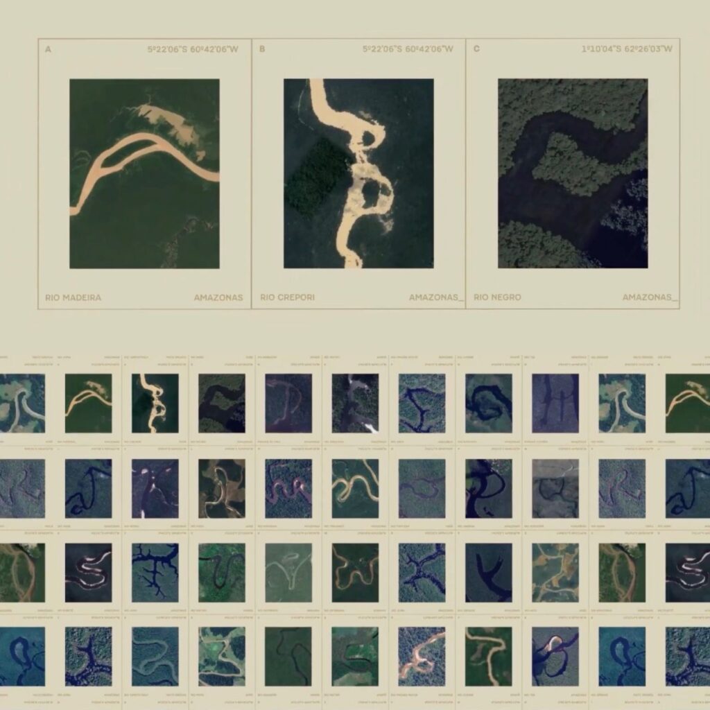
Using real geographic coordinates from the Amazon River and its extensive network of tributaries, the team analysed satellite imagery to uncover natural letterforms hidden within the landscape. The outcome is a bespoke alphabet shaped entirely by nature, where each curve and contour mirrors the winding waterways that stretch across 25,000 kilometres of navigable river. The resulting logotype is not merely inspired by the Amazon—it is constructed from it.
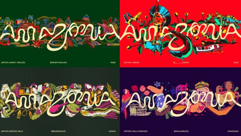
What sets this project apart is its evolution beyond a static identity. The typographic system functions as an interactive platform, allowing users to generate their own compositions using the river-based letterforms. This participatory approach transforms the brand into a collaborative tool, inviting artists, communities, and stakeholders to extend and reinterpret its visual language.
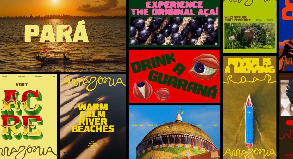
Described as “created by people, written by rivers”, the identity operates as more than a design exercise. It establishes a seal for Amazonian products, reinforcing provenance while promoting local economies across the nine states. By embedding cultural and geographical authenticity into every element, the project underscores the value of locally driven, sustainable branding in a globalised market.
In an era where brands often prioritise uniformity, this initiative stands as a compelling example of how design can honour complexity, celebrate place, and foster meaningful engagement. By turning geography into typography, FutureBrand São Paulo has not only reimagined branding but has also created a living system that grows, adapts, and flows—much like the Amazon itself.
Discover more from Creative Brands Mag
Subscribe to get the latest posts sent to your email.


Leave a comment