


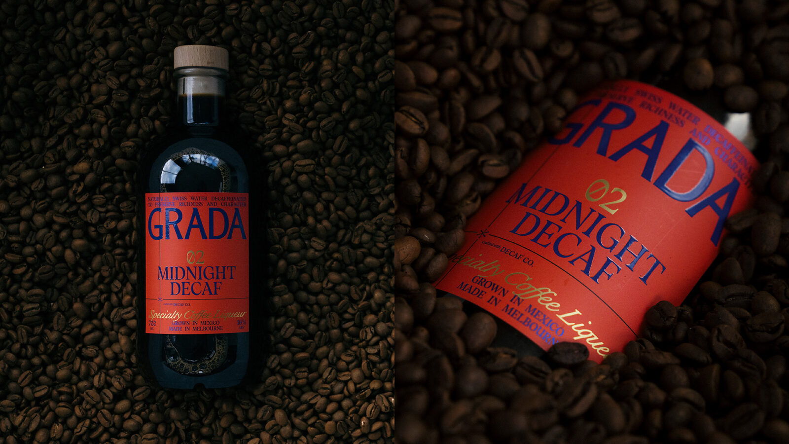
Australian coffee liqueur brand Grada introduces Midnight Decaf with bold new packaging by Weave. Blending its signature blue with vibrant orange, the design redefines decaf perceptions while preserving brand identity. Developed with Decaf Co using the Swiss Water process, the launch highlights craft, collaboration and innovation in specialty spirits.
Australian specialty coffee liqueur brand Grada has unveiled a striking new packaging design to mark the launch of its much-anticipated decaffeinated expression, Midnight Decaf, signalling both a visual and conceptual evolution for the young but ambitious label. Created in collaboration with independent creative agency Weave, the new look builds on the identity established for its debut product, Single Origin, while confidently stepping into new territory.
Founded by Roscoe Power, Grada emerged from Australia’s globally recognised coffee culture with a mission to translate specialty-grade coffee craftsmanship into the world of liqueurs. The success of its inaugural release in October 2025 laid the groundwork for expansion, and Midnight Decaf arrives as both a response to consumer curiosity and a challenge to long-held assumptions about decaffeinated coffee.
Rather than treating decaf as an afterthought, the brand has positioned it as a product of equal standing, demanding a packaging system that reflects both continuity and distinction. Weave’s brief was to ensure Midnight Decaf unmistakably belongs within the Grada portfolio while asserting its own identity on increasingly crowded retail shelves.
The result is a careful balance of consistency and contrast. Grada’s signature blue remains the anchor of the visual system, a deliberate choice in a category typically saturated with warm browns and amber tones. This continued use of blue reinforces brand recognition while signalling a modern, design-led approach. For Midnight Decaf, however, the introduction of a bold orange secondary palette injects warmth and accessibility, offering a visual cue that differentiates it from its predecessor without fragmenting the overall brand language.
Premium detailing, including gold foil accents and refined finishes, underscores the product’s craft credentials, ensuring the packaging communicates quality as effectively as the liquid inside. A notable evolution is seen in the reinterpretation of Grada’s crosshair motif. Originally used to denote the geographic origin of beans, it has been reimagined to highlight collaboration, specifically the partnership with Decaf Co, marking a subtle but meaningful shift in narrative from provenance to process.
According to Dan Cookson, the approach was rooted in refinement rather than reinvention. Retaining blue as the masterbrand’s defining feature was essential, he noted, while the addition of orange and the evolved crosshair device allowed the system to feel cohesive yet forward-looking.
Midnight Decaf itself has been developed in partnership with Brendon Bonacci, a prominent advocate for high-quality decaffeinated coffee. Using the Swiss Water process, the product prioritises flavour integrity and balance, reinforcing Grada’s commitment to craftsmanship over convention. The collaboration aims to dispel the persistent notion that decaf equates to diminished quality, instead presenting it as a considered and sophisticated alternative.
Power emphasised that the packaging was integral to this message, needing to stand alongside Single Origin as an equal rather than a derivative extension. The outcome reflects a shared understanding between brand and agency, where design becomes a vehicle for storytelling as much as differentiation.
As Grada continues to expand its footprint in the specialty spirits market, Midnight Decaf represents more than just a new product. It signals a maturation of the brand’s identity, where innovation in flavour is matched by clarity in visual communication. Available online through Grada and Decaf Co, the release underscores a broader shift within the industry, where craft, collaboration and contemporary design increasingly define the future of premium beverages.
Discover more from Creative Brands Mag
Subscribe to get the latest posts sent to your email.











Leave a comment