

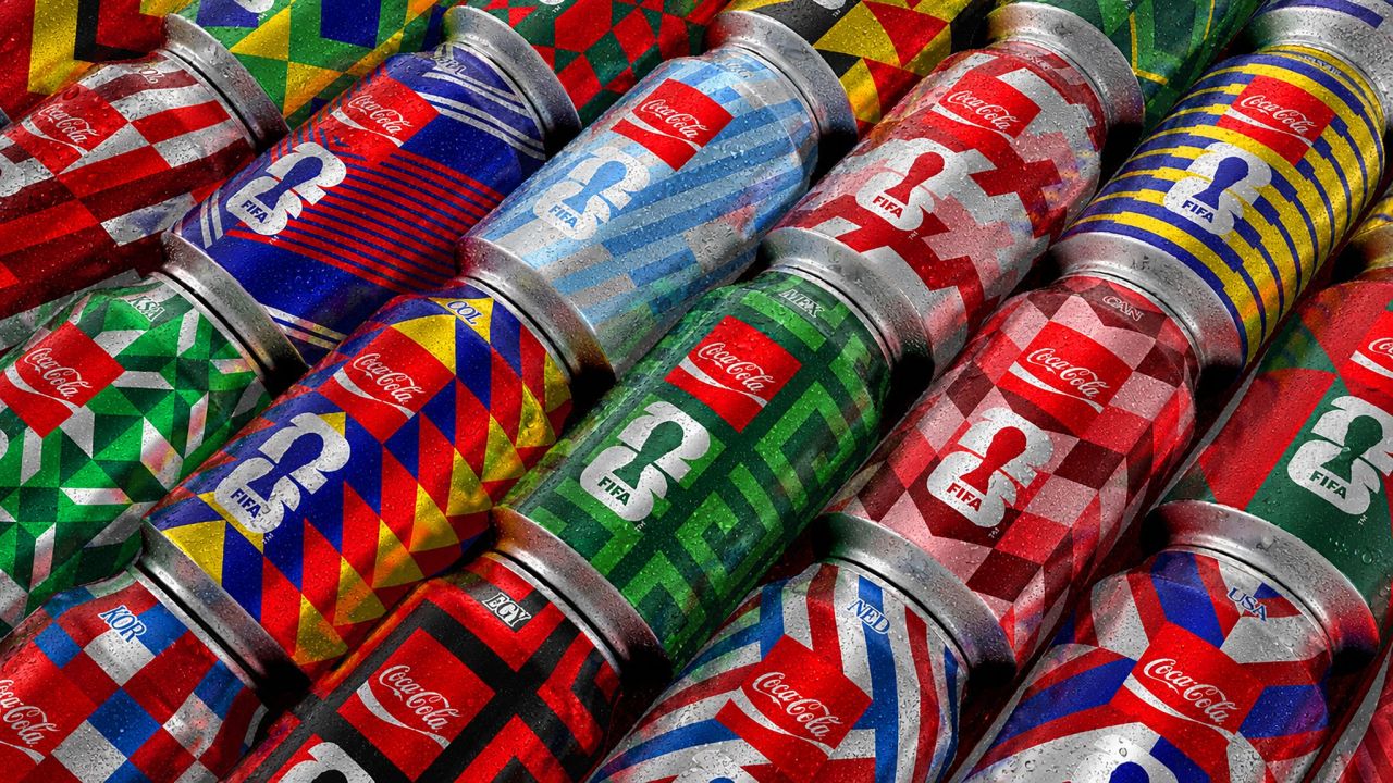
Coca-Cola’s World Cup 2026 campaign, “Poetics of Design,” builds on the Arden Square to create a flexible grid system. Forty-eight collectible cans balance global identity with local resonance. By prioritising structure over spectacle, the design achieves longevity, proving that disciplined systems can outlast the fleeting noise of tournament branding.
In the world of FIFA World Cup branding, campaigns often blur into the background. They are everywhere, yet rarely distinctive—visual wallpaper that fills space without leaving a mark. For 2026, The Coca-Cola Company has chosen a strikingly different approach. Their campaign, “Poetics of Design – Design Playing the Beautiful Game,” is not built on a fleeting look but on a system, one that transforms design into a language of structure and meaning.


At its heart lies the Arden Square, a familiar element of Coca-Cola’s brand identity. From this single square emerges a grid that can shift and adapt, becoming a football pitch, a national flag, a crowd in motion, or even a tactical formation. This modular system allows Coca-Cola to produce 48 collectible cans, each representing a participating nation. Every can unmistakably carries the Coca-Cola identity, yet simultaneously reflects something culturally specific. Achieving this duality—global consistency with local resonance—is a design feat that is harder to pull off than it sounds.
The brilliance of the system lies in its discipline. The grid remains constant, while colours, patterns, and references change. This consistency avoids the need for loud declarations of local relevance. The design simply embodies it. Whether seen in a corner shop or scaled up into a stadium installation, the visual language feels authentic, adaptable, and deeply connected to the occasion.
This is where Coca-Cola’s campaign diverges from the norm. Most World Cup designs are tied too tightly to the tournament itself, their relevance evaporating once the final whistle blows. They are clever in the moment but lack longevity. Coca-Cola’s system, however, is built on something more enduring. A strong structure does not age; it remains flexible enough to accommodate new contexts. The World Cup may pass, but the design framework continues to hold meaning.
By resisting the temptation to chase novelty for its own sake, Coca-Cola has created a campaign that feels both fresh and timeless. It is not about shouting louder than competitors or flooding the market with generic imagery. Instead, it is about trusting the power of design systems to carry cultural weight. In doing so, Coca-Cola has turned a global sporting event into a canvas for design poetry—where every square, every grid, and every can tells a story that is both universal and particular.
The result is a campaign that does more than decorate the World Cup. It plays the beautiful game in its own right, showing how design can be as strategic, as disciplined, and as expressive as football itself.
Discover more from Creative Brands Mag
Subscribe to get the latest posts sent to your email.


Leave a comment