

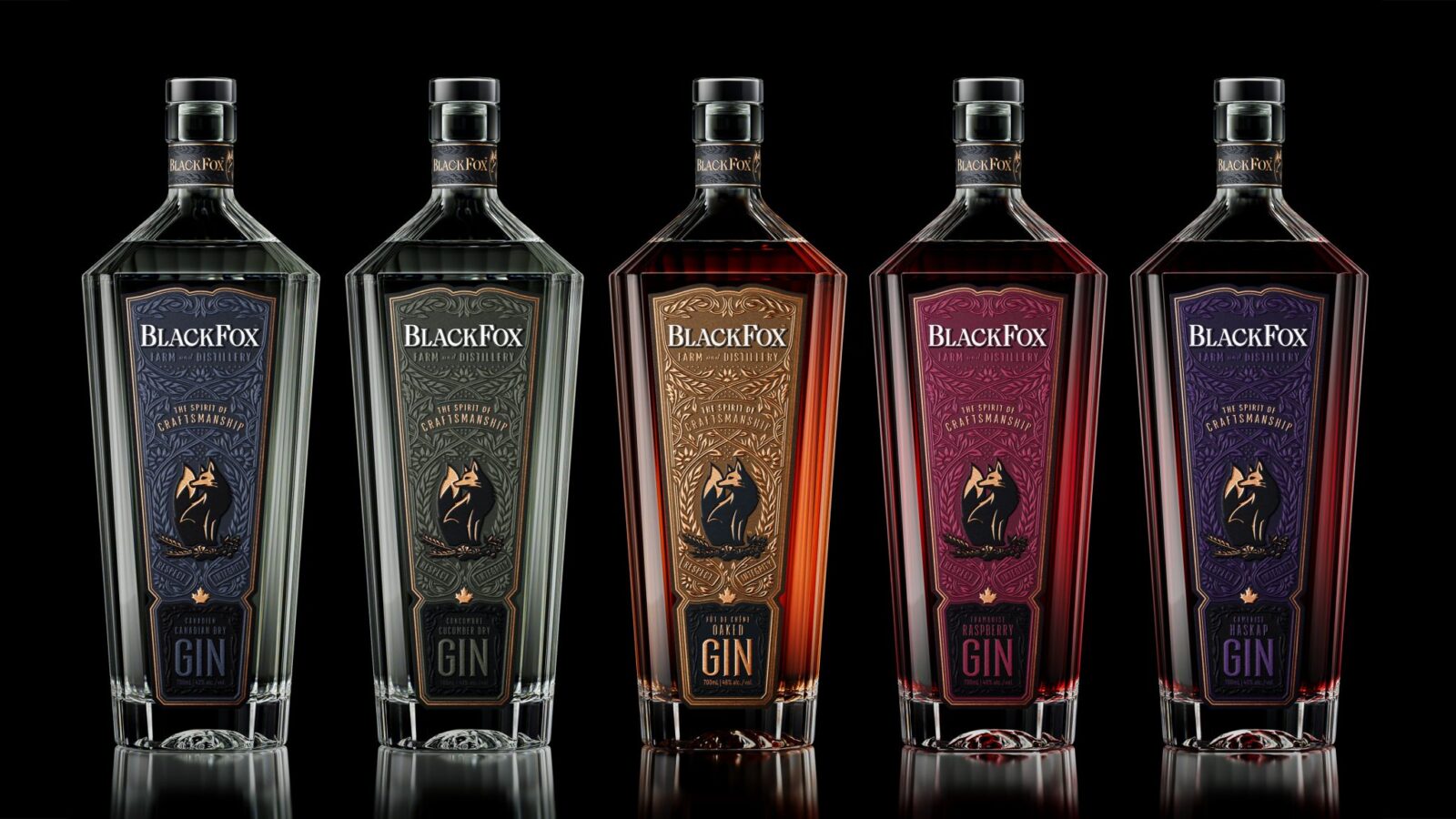
Think Bold Studio has reimagined the packaging for BlackFox Distillery’s award-winning spirits, blending illustration and modern design. Inspired by prairie landscapes and the agility of the fox, the new look reflects the distillery’s farm-to-still philosophy, emphasising authenticity, craftsmanship, and a strong connection to its natural origins.
BlackFox Distillery has unveiled a striking new visual identity for its range of award-winning spirits, following a creative collaboration with Think Bold Studio that aims to align the brand’s packaging with the care and craftsmanship behind every bottle.
The redesign centres on translating the distillery’s ethos into a tactile and visual experience. Rooted in a “farm-to-still” philosophy, BlackFox Distillery grows its own ingredients, a commitment that the new packaging seeks to communicate through a design language that feels both organic and contemporary. Think Bold Studio approached the project with a clear objective: to ensure that the exterior of each bottle reflects the same attention to detail as the spirit within.
Drawing inspiration from the expansive beauty of the Canadian prairies, the design incorporates a sense of openness and natural rhythm. This is paired with the symbolic presence of the fox—an animal associated with agility and sharpness—captured through finely crafted illustrations that lend the packaging a distinctive character. These elements are juxtaposed with bold, modern shapes, creating a balance between tradition and innovation.
The result is a visual identity that not only elevates shelf appeal but also tells a story of provenance and process. By embedding cues of landscape, motion, and craftsmanship into the design, the packaging reinforces the authenticity of BlackFox Distillery’s approach, offering consumers a more immersive connection to the brand.
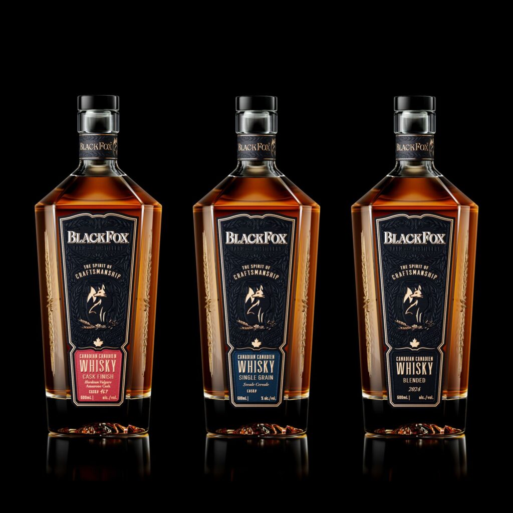
In an increasingly competitive spirits market, where storytelling and differentiation are key, the redesign positions BlackFox Distillery as both grounded in its roots and forward-looking in its presentation. The collaboration demonstrates how thoughtful design can extend beyond aesthetics, serving as a bridge between product, place, and philosophy.
Discover more from Creative Brands Mag
Subscribe to get the latest posts sent to your email.


Leave a comment