

Canary Cocktails gave Young Jerks total creative freedom to design packaging that reflects the drink’s fun. The result is a pastel-toned, logotype-led brand world that feels fresh and disruptive. By resisting micro-management, the brand proves cultural cool comes from trusting experts, not designing by committee.
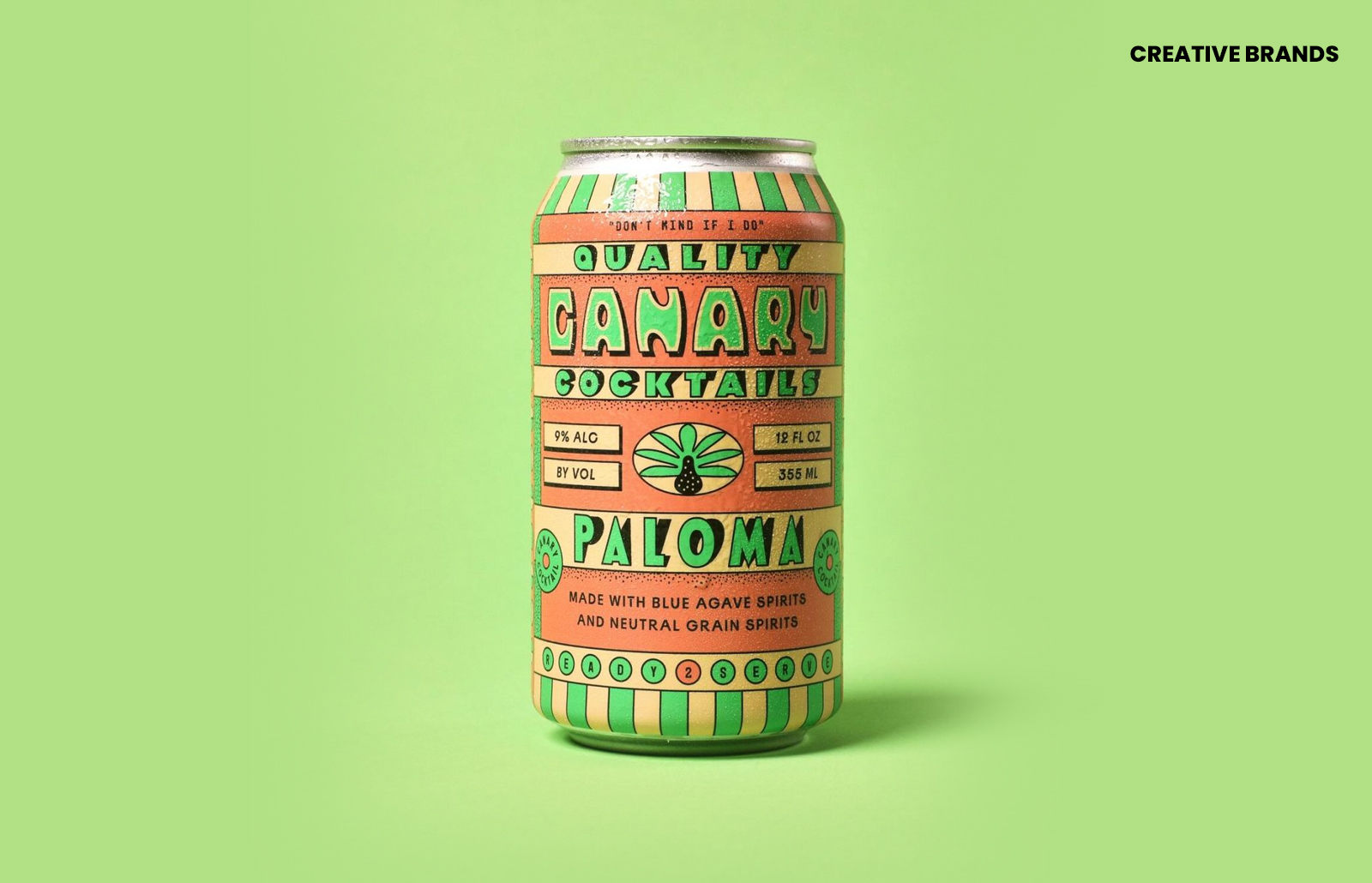
“Make it cool” is often described as the hardest creative brief in the world. For Canary Cocktails, a canned cocktail brand determined to stand out, the solution was radical: hand over total creative freedom to the legendary design team Young Jerks. The brief was stripped back to its essence — make the packaging reflect the fun of the drink.
The result is a brand world that feels immersive, fresh and culturally resonant. Built on custom logotypes and timeless pastel colour palettes, the identity is striking yet approachable, playful yet polished. It is the kind of design that doesn’t just sit on a shelf but commands attention, inviting consumers into a world where cocktails are not only convenient but also aspirational.


This approach is rare in consumer packaged goods. Most founders are terrified of giving designers such latitude. Instead, they crowd briefs with corporate checklists, feature requests and competitor lookalikes. The creative spark is smothered under layers of caution, resulting in packaging that is safe, predictable and indistinguishable from the background noise of the aisle.
Canary Cocktails demonstrates the opposite. By trusting specialists to break the rules, the brand has achieved true shelf disruption. It is a reminder that cultural cool cannot be manufactured by committee. It requires confidence in expertise, a willingness to embrace risk, and an understanding that design is not a box-ticking exercise but a language of emotion, aspiration and identity.
Young Jerks’ work here underscores the value of creative autonomy. Their pastel palette feels timeless yet contemporary, their logotypes are distinctive without being alienating, and the overall system is coherent enough to build recognition while flexible enough to evolve. It is a masterclass in how design can embody the spirit of a product rather than merely decorate it.
The lesson for the wider industry is clear. If brands want to cut through, they must resist the urge to micro-manage. Packaging is not just a container; it is a cultural artefact, a signal of intent, and often the first touchpoint for consumers. To make it cool, you have to let creativity breathe. Canary Cocktails has shown that when you trust the process, the result is not only beautiful but commercially powerful.
Discover more from Creative Brands Mag
Subscribe to get the latest posts sent to your email.


Leave a comment