

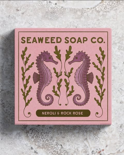
Amie George has crafted a packaging identity for Seaweed Soap Co. that captures the essence of the coast with elegance and artistry. Each design features a hand-drawn marine creature, framed by decorative flourishes that evoke both natural beauty and refined craftsmanship. The illustrations are detailed yet approachable, giving the brand a distinctive personality rooted in its seaside inspiration.
The colour palette is soft but vibrant, balancing gentle tones with lively accents that ensure shelf presence without overwhelming the eye. Textured finishes add a tactile dimension, reinforcing the premium quality of the product and inviting consumers to engage with the packaging as much as the soap itself.


By combining illustration, decorative framing, and carefully chosen colours, George has created a visual system that feels both artisanal and contemporary. It positions Seaweed Soap Co. as a brand that values authenticity and storytelling, while delivering a polished aesthetic that appeals to discerning audiences. The result is packaging that not only protects the product but also communicates its coastal charm and premium character at first glance.
Amie George’s packaging for Seaweed Soap Co. blends coastal charm with premium design. Hand-drawn marine creatures framed by decorative details, textured finishes, and a soft yet vibrant colour palette create a distinctive identity. The crafted illustrations and tactile elements elevate the brand, ensuring both visual impact and artisanal authenticity.
Discover more from Creative Brands Mag
Subscribe to get the latest posts sent to your email.


Leave a comment