

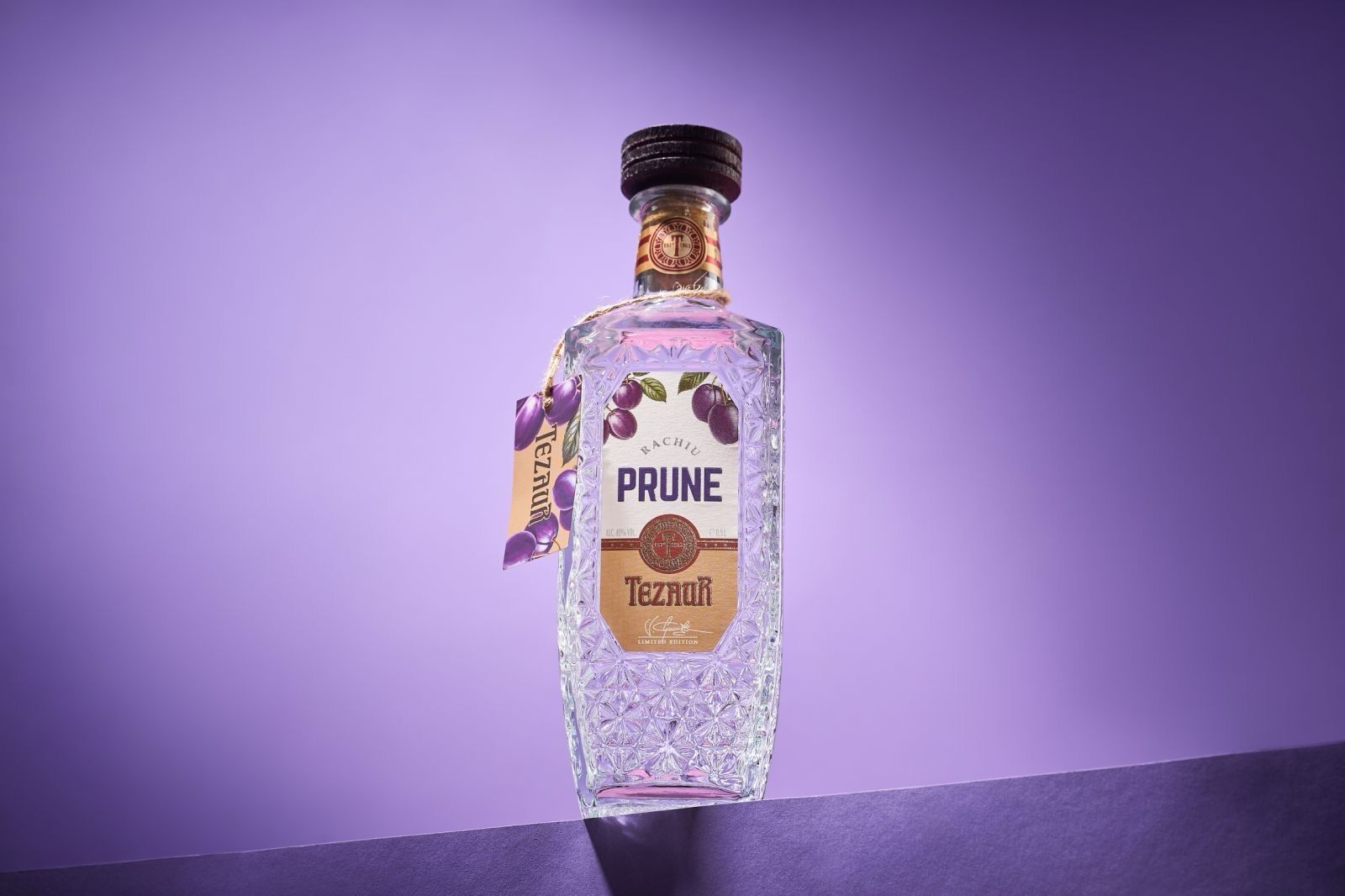
Kappa Company has unveiled a rebrand of Tezaur Plum Rachiu, focusing on aligning packaging with the drink’s depth, craftsmanship and premium identity. The redesign emphasises heritage and quality, aiming to strengthen its positioning in international markets while visually communicating the spirit’s rich plum character and artisanal roots.
Rebranding, when done with intent, is less about aesthetics and more about storytelling. For Moldova’s Kappa Company, the transformation of Tezaur Plum Rachiu represents a deliberate effort to ensure that the product’s external identity reflects the richness within.
The newly unveiled design seeks to capture the essence of the drink—its deep plum character, artisanal craftsmanship and the notion of something rare and valuable. Rather than merely refreshing the label, the company has approached the exercise as a way of aligning perception with reality, allowing the bottle itself to communicate the spirit’s quality and heritage.
At the heart of the rebrand is the idea of “Tezaur”, meaning treasure, a concept the company believes had not been fully realised in the previous visual identity. The updated packaging aims to evoke this sense of worth, presenting the rachiu as a refined, premium offering that stands out in an increasingly competitive global market.
Kappa Company, established in 2016, has built a reputation as a leading Moldovan beverage group, bringing together seven prominent brands across categories including brandy, fruit brandy, wines and whisky. Its portfolio reflects a blend of tradition and innovation, with a strong emphasis on craftsmanship and export-driven growth.
With the reimagined Tezaur Plum Rachiu, the company is reinforcing its commitment to quality while sharpening its global appeal. The redesign not only enhances shelf presence but also serves as a visual narrative—one that speaks of depth, authenticity and the enduring value of well-crafted spirits.
As consumer expectations evolve, particularly in premium segments, packaging has become a critical touchpoint. In this context, Kappa Company’s rebrand underscores a broader industry shift: the recognition that design is not merely decorative, but integral to how a product is experienced, understood and ultimately valued.
Discover more from Creative Brands Mag
Subscribe to get the latest posts sent to your email.


Leave a comment