

Takara Shuzo International has unveiled a global packaging refresh for Tomatin single malts, introducing a wood-grain design and ‘Triple Cask’ positioning for its 12-year-old expression. The revamp underscores craftsmanship and cask management while enhancing shelf presence, as competition intensifies and interest in Scotch distilleries grows worldwide.
Takara Shuzo International has begun rolling out a refreshed packaging design for its Tomatin single malt Scotch whisky range, signalling a renewed emphasis on craftsmanship and cask heritage as the brand sharpens its global positioning.
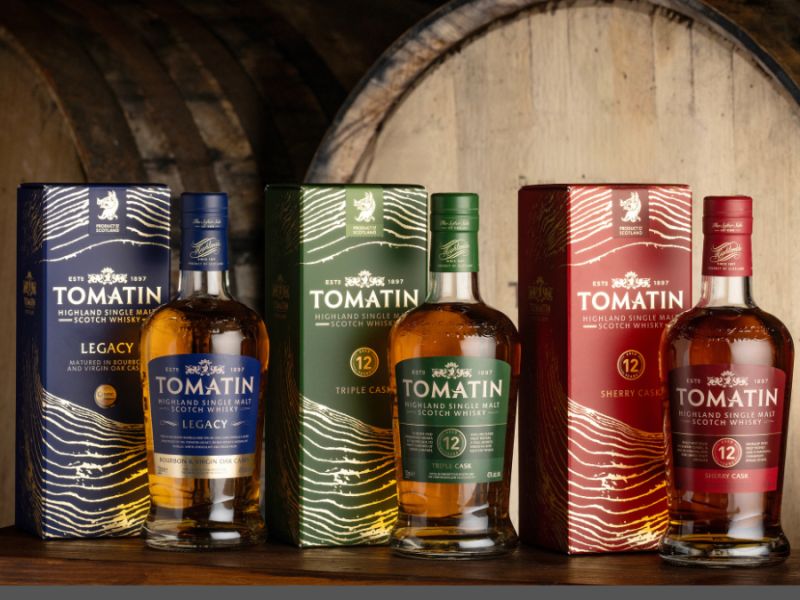
The Japanese owner, which has held Tomatin since 1986, is drawing on the distillery’s on-site cooperage to anchor the redesign. Central to the update is a wood-grain motif featured across the new cartons, intended to evoke the natural rings of oak and highlight the role of wood in the whisky maturation process. The shift marks a deliberate move away from the previous landscape-led aesthetic towards a more tactile and process-driven visual identity.
Alongside the packaging overhaul, Takara Shuzo International is introducing the descriptor ‘Triple Cask’ to Tomatin’s 12-year-old expression, reinforcing its maturation credentials. The updated look and nomenclature debut with the Tomatin 12 Year Old Triple Cask and Legacy expressions, with a phased rollout across global markets beginning this month and extending to the wider core range in the months ahead.
Jennifer Masson, head of marketing at Tomatin, said the redesign brings the brand’s visual identity in line with its core strengths. She noted that the new presentation reflects the distillery’s expertise in cask management, craftsmanship and attention to detail, while also improving visibility in increasingly competitive retail and on-trade environments.
The move comes as Scotch whisky producers continue to refine branding to capture modern consumers and stand out on crowded shelves, particularly in key growth markets. With premiumisation and storytelling playing a critical role in purchasing decisions, the emphasis on wood and maturation aligns with broader industry trends that foreground authenticity and production expertise.
At the same time, interest in Scotch assets remains robust. Earlier this year, Radico Khaitan announced plans to acquire its own Scotch distillery through a newly established Scottish division, underlining the enduring global appeal of the category and the strategic importance of provenance in building premium spirits portfolios.
Discover more from Creative Brands Mag
Subscribe to get the latest posts sent to your email.


Leave a comment