


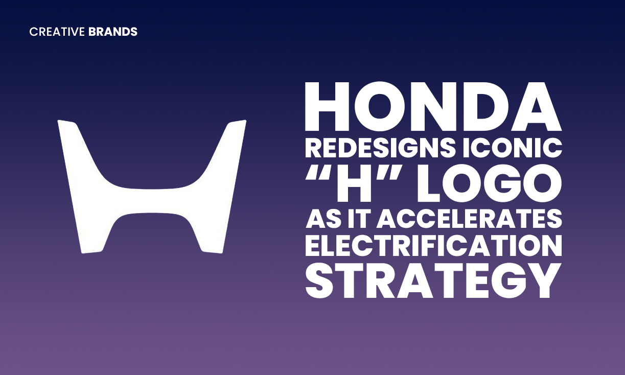
Honda has unveiled its first major logo redesign since 1981, introducing a borderless, widened “H” inspired by 1960s branding and symbolising “two outstretched hands.” Rolling out from 2027 across EVs, hybrids, dealerships, and motorsport programs, the update reflects Honda’s broader shift toward electrification and expanding hybrid offerings through 2030.
Honda has taken a significant step toward reimagining its brand identity, unveiling a refreshed version of its iconic “H” logo — the first major redesign the company has undertaken in more than four decades. The move signals both a nod to the past and a strategic look toward the future as the Japanese automotive giant accelerates its electrification roadmap.
The new emblem, set to debut across vehicles from 2027, departs from the familiar boxed frame that has adorned millions of Honda cars since 1981. In its place is a borderless, wider interpretation of the “H,” influenced by the company’s early badges seen in the 1960s. Honda describes the updated form as evoking “two outstretched hands,” a symbolic gesture intended to communicate openness, warmth, and a collaborative spirit as the company pivots toward next-generation mobility.
Consumers caught an early glimpse of the redesigned badge on Honda’s 0 Series electric vehicle concepts, showcasing how the modernised logo pairs with streamlined EV aesthetics. While the new identity will naturally anchor Honda’s electric ambitions, the company has confirmed it will not be limited to battery-electric models. Select hybrid vehicles will also feature the badge, underscoring Honda’s belief in a multi-path approach to carbon-neutral mobility.
The rollout will extend beyond vehicle fascias. Dealership signage, marketing assets, merchandise, and motorsport activities will adopt the refreshed branding in phases, creating a unified look as Honda prepares for a global product push. The timing aligns with the company’s broader strategy to introduce a new wave of hybrid models by 2030 and expand its EV offerings in competitive markets.
For a brand whose emblem has remained largely untouched since the early days of compact sedans and affordable commuter bikes, the redesign represents a cultural as much as a visual shift. While subtle in form, the new badge marks a moment of reinvention for Honda as it seeks to balance heritage with innovation, signalling to drivers that the future it envisions is already underway.
Discover more from Creative Brands Mag
Subscribe to get the latest posts sent to your email.
















Leave a comment