

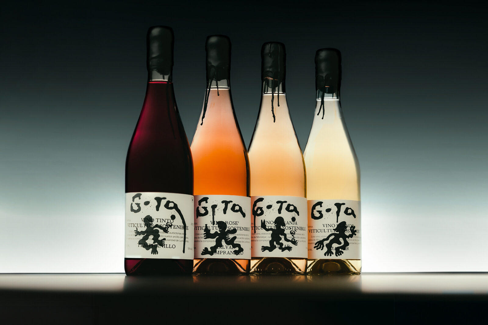
Gota’s creative identity, developed by Faena Studio, blends heritage with modernity. A dynamic logo shifts across bottles, paired with clean typography for balance. Abstract stains and strokes evoke shared wine moments, while character illustrations add warmth. A sober black base frames the transparent bottle, elevating authenticity and ecological commitment.
When Faena Studio set out to shape the creative identity for Gota, the organic wine crafted by a Mexican family in La Alcarria, Spain, they faced a delicate balancing act. The brand needed to feel fresh and contemporary, appealing to a younger, design-conscious audience, while remaining true to its ecological ethos and the region’s reclaimed winemaking tradition. The solution was a visual system that is both dynamic and grounded, expressive yet honest.
At the centre of this identity lies the logo—a mark that subtly shifts across each bottle. This fluidity resists uniformity, suggesting that each encounter with Gota is unique, much like the spontaneous, relaxed moments the wine is designed to accompany. To counterbalance this sense of movement, Faena Studio employed clean, structured typography. The typography anchors the compositions, ensuring clarity and stability, while allowing the logo’s dynamism to shine without overwhelming the design.
The packaging is enriched with abstract stains and strokes, visual cues that evoke convivial gatherings and shared experiences. These marks are not random embellishments; they are metaphors for memory, for the gestures and laughter that accompany wine shared among friends. They remind the drinker that Gota is not just a product, but a participant in life’s fleeting, joyful occasions. Complementing these abstractions are character illustrations—playful, personable figures that lend warmth and humanity to the bottles. Together, these elements create a layered visual language that feels approachable and expressive.
Perhaps the boldest choice is the sober black base. In a category where organic wines often lean towards rustic palettes or earthy tones, Gota’s black backdrop is strikingly modern. It frames the transparent bottle, allowing the wine itself to take centre stage. Transparency here is more than aesthetic—it is a statement of honesty, a refusal to hide behind branding. The product is elevated as the hero, reinforcing the ecological commitment and authenticity at the heart of the brand.
The result is a creative identity that feels distinctive in a crowded market. It avoids clichés, instead offering a fresh, contemporary take on ecological storytelling. It positions Gota as more than a wine: it is an experience, a symbol of La Alcarria’s renewal, and a testament to the family’s vision of blending tradition with modernity. Faena Studio’s work demonstrates how design can embody philosophy, how packaging can become narrative, and how a bottle can carry not just wine but a story of heritage, honesty, and connection.
Discover more from Creative Brands Mag
Subscribe to get the latest posts sent to your email.


Leave a comment