


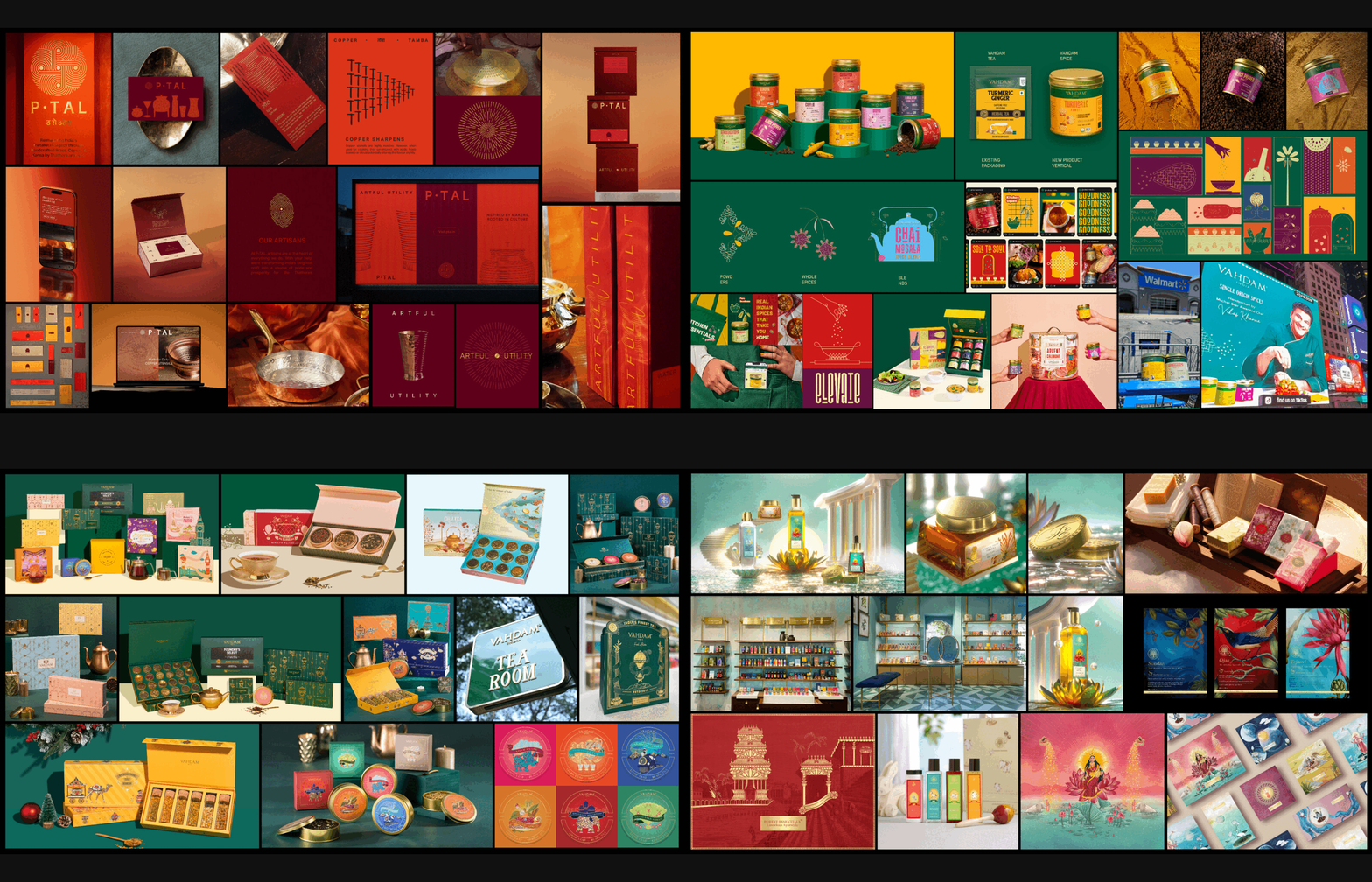
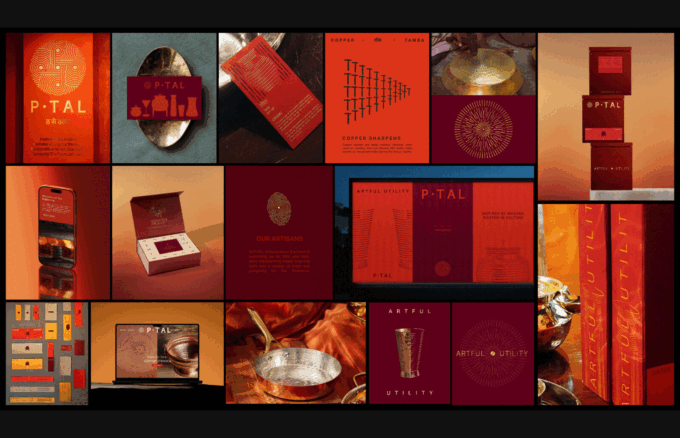
Mother Tongue Design has won two Blue Elephants at the 2026 Kyoorius Design Awards for P•TAL’s rebrand, recognised for reviving a UNESCO-listed craft. The rebrand expanded P•TAL’s global footprint, boosted artisan incomes, eliminated plastic packaging, and repositioned Indian metalware as a modern lifestyle choice, blending heritage with design-led functionality.
Mother Tongue Design (MTD), the Mumbai-based strategy-led creative agency, has won two Blue Elephants at the 2026 Kyoorius Design Awards for its transformative work with P•TAL (Punjab Thathera Art Legacy). The honours came in the categories ‘Integrated’ under the Design Craft track and ‘Brand Identity Refresh & Rebrand: MSME’ under the Design in Action track, recognising the agency’s role in reviving a UNESCO-listed craft and repositioning it for a global audience.
MTD’s approach went far beyond a visual refresh, creating a complete brand system across identity, positioning, packaging and storytelling. The rebrand has enabled P•TAL to serve more than 150,000 customers in over 40 countries, reframing Indian hand-beaten metalware as a design-forward lifestyle choice rather than a commodity. The packaging overhaul eliminated 880 kilograms of plastic, while the brand now supports the livelihoods of more than 125 artisan families, increasing their monthly incomes by 3,500% over three years. This has strengthened the continuity of a UNESCO-recognised tradition while ensuring fairer, more sustainable incomes for craft communities.
The repositioning also delivered significant business milestones. P•TAL was selected as one of only five Indian brands to showcase at Shoppe Object in New York, expanded its retail footprint with an Exclusive Brand Outlet in Hyderabad’s Banjara Hills, and raised $3 million in Series-A funding led by VC Grid with participation from Rainmatter, the fund backed by Zerodha’s Nithin Kamath. The rebrand shifted perceptions of the category from traditional cookware to modern, health-conscious lifestyle products, resonating with younger, globally aware audiences seeking authenticity, wellness and design-led functionality.
Shruti Singhi, Founder & Creative Director at MTD, reflected on the win: “Trends move fast but culture moves slow, and that’s exactly why it lasts. When a brand is genuinely rooted in something real, it doesn’t need to chase relevance, rather it becomes relevant on its own terms. These two Blue Elephants belong as much to the artisans as they do to us. P•TAL taught us that when you listen closely to the craft and the people behind it, design finds its own voice.”
Aditya Agrawal, CEO & Co-founder of P•TAL, added: “The idea behind refreshing our brand identity was about creating a brand that could connect with audiences beyond India, while staying rooted in our craft and heritage. We’re grateful to see this intent recognised through our design partner, Mother Tongue Design, and thank Shruti and the MTD team for translating our craft, process and community into something our artisans can be proud to see travel the world.”
The rebrand drew inspiration directly from the Thathera workshop, with MTD defining five pillars—material, functionality, craftsmanship, revival and Ayurveda. The colour palette was derived from the workshop floor: charcoal, the amber glow of fire, and the deep tones of tamarind used to clean the metal. Vessel silhouettes echoed hammer marks and transformation, keeping the graphic language tied to the hands and techniques behind each object.
Since its founding in 2012, MTD has resisted easy categorisation, building a strategy-led practice at the intersection of culture and craft. Across its work with brands such as Forest Essentials, Vahdam, Maska and Nimai, the agency has consistently treated culture as the root system from which a brand grows. P•TAL’s rebrand is not an outlier but a distillation of this philosophy—an identity forged in the workshop, carried into homes worldwide.
Discover more from Creative Brands Mag
Subscribe to get the latest posts sent to your email.












Leave a comment