

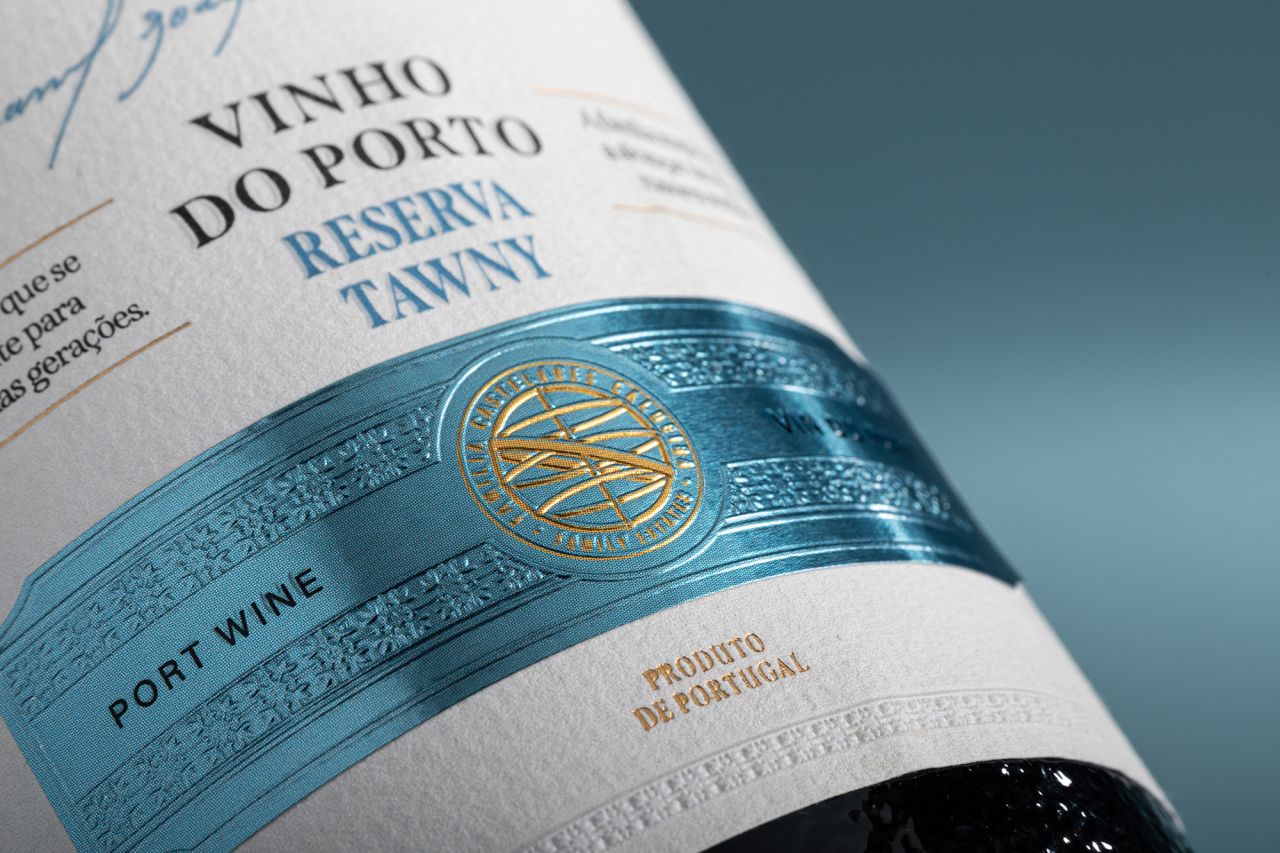
M&A Creative Agency has unveiled the luxury packaging design for A Escolha do Caldeira, a premium Port wine that embodies heritage and modern refinement. With embossed leather, natural cork, and minimalist elegance, the design honours the Caldeira family’s legacy while elevating Portuguese winemaking into a tactile, timeless experience.
M&A Creative Agency has presented a striking new packaging design for A Escolha do Caldeira, a Port wine that carries with it the weight of tradition and the promise of continuity. For Mr. Caldeira, wine is not merely a craft but a dialogue across generations, a patient commitment to history, and a pledge that the wisdom of the past will endure in the hands of those who follow. Each bottle of Escolha do Caldeira is a vessel of dedication, respect for the land, and reverence for the family story that shaped it.
The bespoke packaging reflects this philosophy with meticulous attention to detail. Premium blind embossing paired with refined spot colour highlights creates a tactile experience that engages the consumer before the cork is even drawn. The deep impression of motifs and the inscription “VINHO DO PORTO RESERVA TAWNY” lends a three-dimensional elegance to the minimalist white surface, balancing restraint with sophistication.
A subtle interplay of matte white embossing and selective blue ink detailing enhances the sense of craftsmanship, underscoring the quiet refinement that defines high-quality wine presentation. The design speaks with understated confidence, marrying modern elegance with the timeless heritage of Portuguese winemaking.
The bottle is crowned with a custom natural cork, wrapped in embossed leather of deep tones. This tactile element evokes strength, resilience, and authenticity, reinforcing the sensory richness of the packaging. The leather is more than decorative; it is symbolic of permanence and heritage, a reminder of the enduring traditions that underpin the Caldeira family’s work.
Personalisation adds a final flourish. A finely crafted leather strip, pressed with the family name, transforms the bottle into a symbol of lineage and pride. This detail elevates the packaging from a protective shell into an emblem of identity, ensuring that every bottle is not only a product but a story.
The design is a tribute to Mr. Caldeira’s vision of building something greater than himself. It encapsulates the essence of legacy, dedication, and the enduring spirit of Portuguese winemaking. Through A Escolha do Caldeira, the Família Castelares Caldeira raises a glass to the future while preserving the past, sealing history and heritage in every bottle.
Discover more from Creative Brands Mag
Subscribe to get the latest posts sent to your email.


Leave a comment