


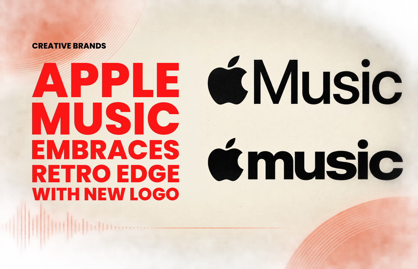
Apple Music has unveiled a bold new logo, replacing its clean, minimal design with a lowercase wordmark inspired by Y2K aesthetics. The rebrand coincides with the launch of Apple Music Hall in London, signalling a fresh chapter in the streaming service’s visual identity and cultural positioning.
Apple Music has taken a striking step away from its familiar sleek minimalism, unveiling a new logo that embraces a retro, Y2K-inspired aesthetic. The transformation introduces a bold lowercase wordmark, a departure from the restrained clarity that has defined the brand since its inception. The move reflects a deliberate shift in tone, one that seeks to capture nostalgia while signalling a new era of cultural engagement.
The timing of the redesign is no coincidence. Apple Music has simultaneously launched Apple Music Hall in London, a venue dedicated to live performances and immersive experiences. This physical space anchors the brand in the cultural fabric of one of the world’s most influential music capitals, offering a tangible extension of its digital presence. The new logo, with its playful nod to early‑2000s design language, mirrors the ambition to blend heritage with contemporary relevance.
For years, Apple Music has leaned on the power of simplicity, its clean lines and minimal typography reinforcing Apple’s broader design philosophy. Yet the streaming landscape has evolved, with rivals such as Spotify and Amazon Music experimenting with bolder, more expressive identities. Apple Music’s pivot suggests recognition that visual identity must resonate emotionally as much as functionally. The lowercase styling softens the brand’s voice, while the retro cues evoke an era when digital music first began reshaping listening habits.
The launch of Apple Music Hall underscores this repositioning. More than a venue, it represents a statement of intent: Apple Music is not merely a platform but a cultural player, curating experiences that extend beyond playlists and algorithms. The logo’s nostalgic energy aligns with this ambition, inviting audiences to see Apple Music as both a modern innovator and a custodian of musical memory.
Industry observers note that the rebrand reflects broader trends in design, where Y2K aesthetics have resurged across fashion, media and technology. By adopting this visual language, Apple Music taps into a generational mood, appealing to younger audiences while rekindling familiarity for those who lived through the early digital music boom.
As Apple Music Hall opens its doors in London, the new logo will serve as a beacon of this refreshed identity. It is a bold gamble, but one that positions Apple Music to stand out in a crowded market by embracing the emotional resonance of design. The lowercase wordmark may be small in form, but it signals a big shift in how Apple Music wants to be seen: not just as a service, but as a cultural stage
Discover more from Creative Brands Mag
Subscribe to get the latest posts sent to your email.















Leave a comment