

AEVUM, a premium longevity supplement, unveils a monochrome identity by Greatergood centred on the Fountain of Youth. Rejecting trend-driven aesthetics, the brand embraces geological stillness and timeless design. With a bespoke monogram and carved wordmark, AEVUM positions itself as a credible challenger built to endure, reflecting its name’s meaning: eternity.
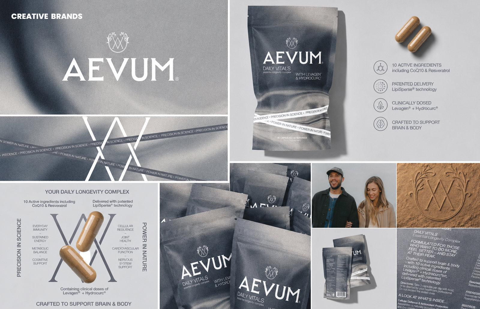
AEVUM, a new premium longevity supplement, has launched with a striking visual identity by London-based agency Greatergood. Rejecting the clinical whites, pastel geometrics, and trend-driven greens that dominate the category, the brand instead draws on one of humanity’s oldest symbols: the Fountain of Youth.
Rendered in monochrome against deep slate grey, the imagery conveys geological stillness and endurance rather than lifestyle aspiration. Still water becomes a mirror, evoking timelessness and elemental permanence. At the centre sits a bespoke monogram – the intersecting A and V framed botanically – embodying the brand’s creative tension: Precision in Science, Power in Nature.
Founder Daniel Hinde explains: “AEVUM’s formulation was exceptional, and the brand had to reflect that. Consumers want supplements that feel credible and lasting, not trend-chasing. We wanted AEVUM to look as considered in five years as it does on launch day.” The name itself, Latin for eternity, shaped every design decision, from the carved architectural wordmark to the packaging system and DTC presence.
The scope of work spanned brand strategy, packaging, website, and merchandise, resulting in an identity that carries the authority of a heritage mark without institutional coldness. By rejecting fleeting aesthetics, AEVUM positions itself as a challenger brand built to endure – a supplement identity rooted in permanence, not passing fashion.
Discover more from Creative Brands Mag
Subscribe to get the latest posts sent to your email.


Leave a comment