

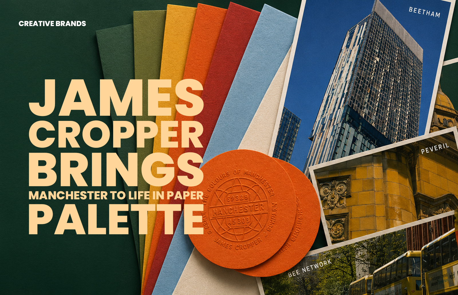
James Cropper unveiled The Colours of Manchester at The Independent Paper Show 2026, distilling the city’s architecture, atmosphere and cultural identity into a six‑colour palette. Created with Winter & Company, the project blends heritage papermaking with cultural observation, reframing paper as a medium capable of carrying memory, identity and emotion.
At the inaugural Manchester edition of The Independent Paper Show 2026, master papermaker James Cropper revealed The Colours of Manchester, a campaign that transforms the city’s visual identity into a living paper palette. Conceived in collaboration with Winter & Company, the project explores how colour often defines a city long before its landmarks do, capturing the tones that quietly shape Manchester’s collective memory.
Through street photography and observational storytelling, the palette draws from rain‑darkened streets beneath tramline yellow, industrial brick softened by northern light, shifting blues reflected in glass towers and canal water, and the muted mineral greys of Manchester skies. These impressions were distilled into six core Coloursource™ expressions: Vermillion, Azure, Bright Yellow, Grey, Chartreuse and Mandarin. Each shade was selected from a broader field of observed tones, anchoring colour to place and memory rather than abstract invention.
“Before colour becomes branding, it is place,” explained Jordan Scott, Head of Marketing for James Cropper. “Manchester has a visual language entirely its own, shaped by weather, music, architecture, sport and industry. This project was about observing those details closely and translating them into paper in a way that feels emotionally true to the city.”
Ahead of the show, James Cropper launched a social‑first teaser campaign asking Mancunians a simple question: What colour is Manchester? Responses ranged from tram network yellow and worker‑bee iconography to canal water, football culture, brickwork and overcast skies. These conversations became part of the project itself, building a collective portrait of the city through shared visual memory.
Presented in a deliberately stripped‑back exhibition space, the installation showcased Manchester‑inspired colours through large‑scale photography, tactile paper applications and embossed takeaways produced at the company’s historic mill in Cumbria. Visitors were invited to emboss their own interpretation of Manchester’s defining colour, turning the stand into an evolving study of identity and atmosphere.
The campaign also highlights James Cropper’s ongoing partnership with Winter & Company around the Coloursource™ collection, reinforcing the papermaker’s position as one of the UK’s last remaining speciality mills operating at scale. By blending heritage craftsmanship with contemporary cultural observation, The Colours of Manchester positions paper not simply as a substrate but as a medium capable of carrying atmosphere, identity and emotional permanence. In doing so, it reframes colour as something discovered within landscapes, structures and stories people already instinctively recognise.
Discover more from Creative Brands Mag
Subscribe to get the latest posts sent to your email.


Leave a comment