

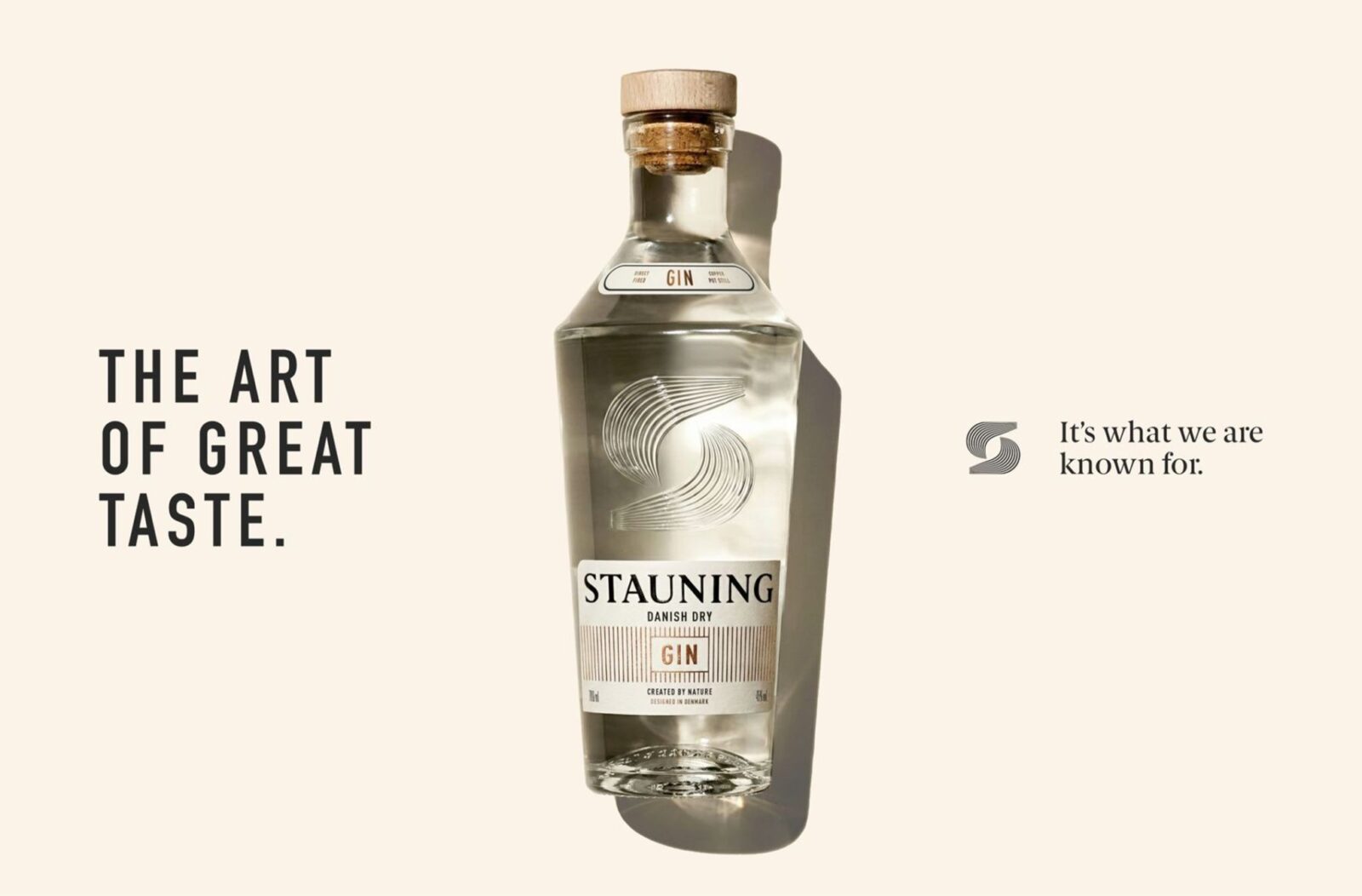
Stauning Gin, designed by Within Design Studio, builds on the distillery’s whisky legacy with a fresh, exploratory spirit. Rooted in Danish precision and design, its packaging blends tactile printmaking influences with expressive artwork, creating a refined yet experimental identity that expands Stauning’s brand world while honouring its craft heritage.
Stauning Whisky has long been celebrated for its meticulous grain-to-glass philosophy, a commitment that has defined the Danish distillery’s reputation for precision and authenticity. Now, with the launch of Stauning Gin, the brand ventures into a more playful and exploratory category, extending its craft legacy while embracing a new creative dimension.
The challenge was clear: how to introduce a gin that feels inventive and expressive, yet remains firmly anchored in the principles of Danish design. Within Design Studio took on this task, crafting a packaging system that reflects both tradition and experimentation. The result is a visual identity that balances structure with spontaneity, inviting curiosity while maintaining the brand’s refined sensibility.
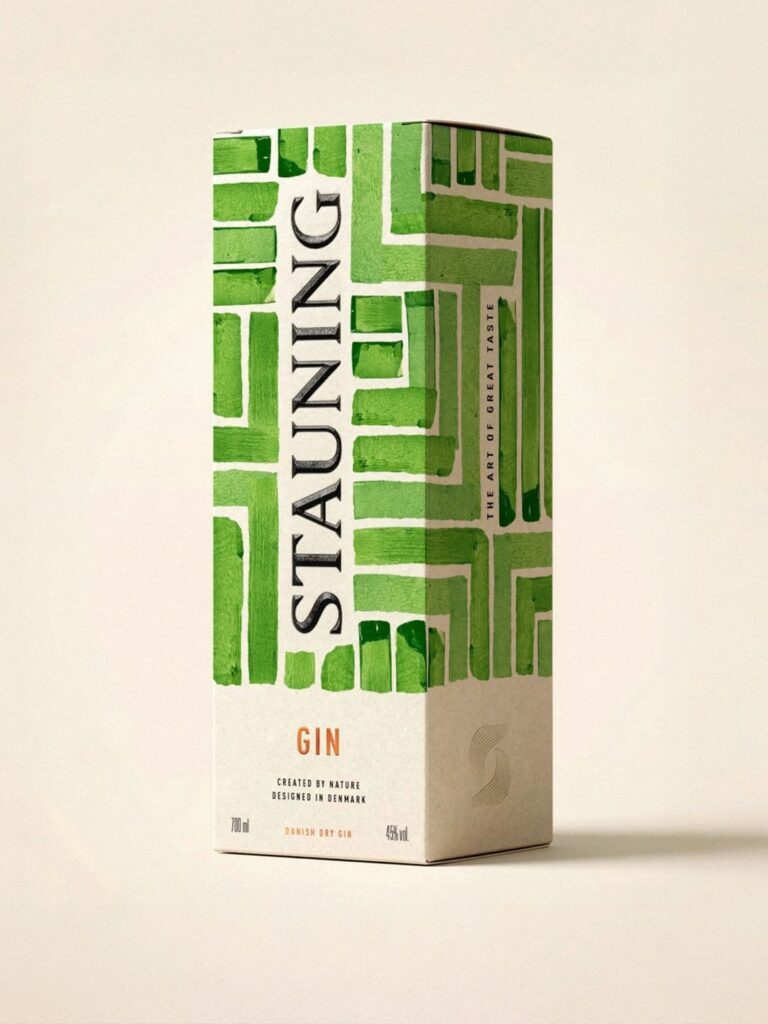
Inspired by Danish printmaking, the design employs a tactile, layered language that encourages discovery at every touchpoint. Structured compositions provide a sense of order, while expressive artwork introduces dynamism and intrigue. This interplay mirrors the dual nature of Stauning Gin itself—rooted in craft yet open to exploration, precise yet playful.
The packaging is more than a vessel; it is a narrative device that expands Stauning’s brand world. Each element has been considered to evoke both heritage and innovation, ensuring that the gin feels like a natural extension of the distillery’s ethos. The layered visuals invite consumers to engage with the product beyond its function, transforming the act of pouring a drink into an experience of design and storytelling.
For Stauning, the move into gin is not simply about diversification. It is about demonstrating how a brand steeped in tradition can evolve without losing its essence. By collaborating with Within Design Studio, the distillery has created an identity that resonates with contemporary audiences while remaining faithful to its roots. The gin’s packaging embodies this philosophy, offering a refined yet experimental aesthetic that reflects both the precision of Danish craft and the joy of creative exploration.
In a crowded spirits market, where design often serves as the first point of connection, Stauning Gin stands out by weaving heritage into modernity. Its packaging system does not merely decorate but communicates, telling a story of balance—between structure and expression, tradition and innovation, whisky and gin.

Ultimately, Stauning Gin represents a bold yet thoughtful expansion of the distillery’s craft legacy. It is a product that invites discovery, not only through its flavour but through its design. By embracing creativity while honouring precision, Stauning has ensured that its journey into gin feels both authentic and exciting, a testament to the enduring power of Danish design principles in shaping contemporary brand identities.
Discover more from Creative Brands Mag
Subscribe to get the latest posts sent to your email.


Leave a comment