

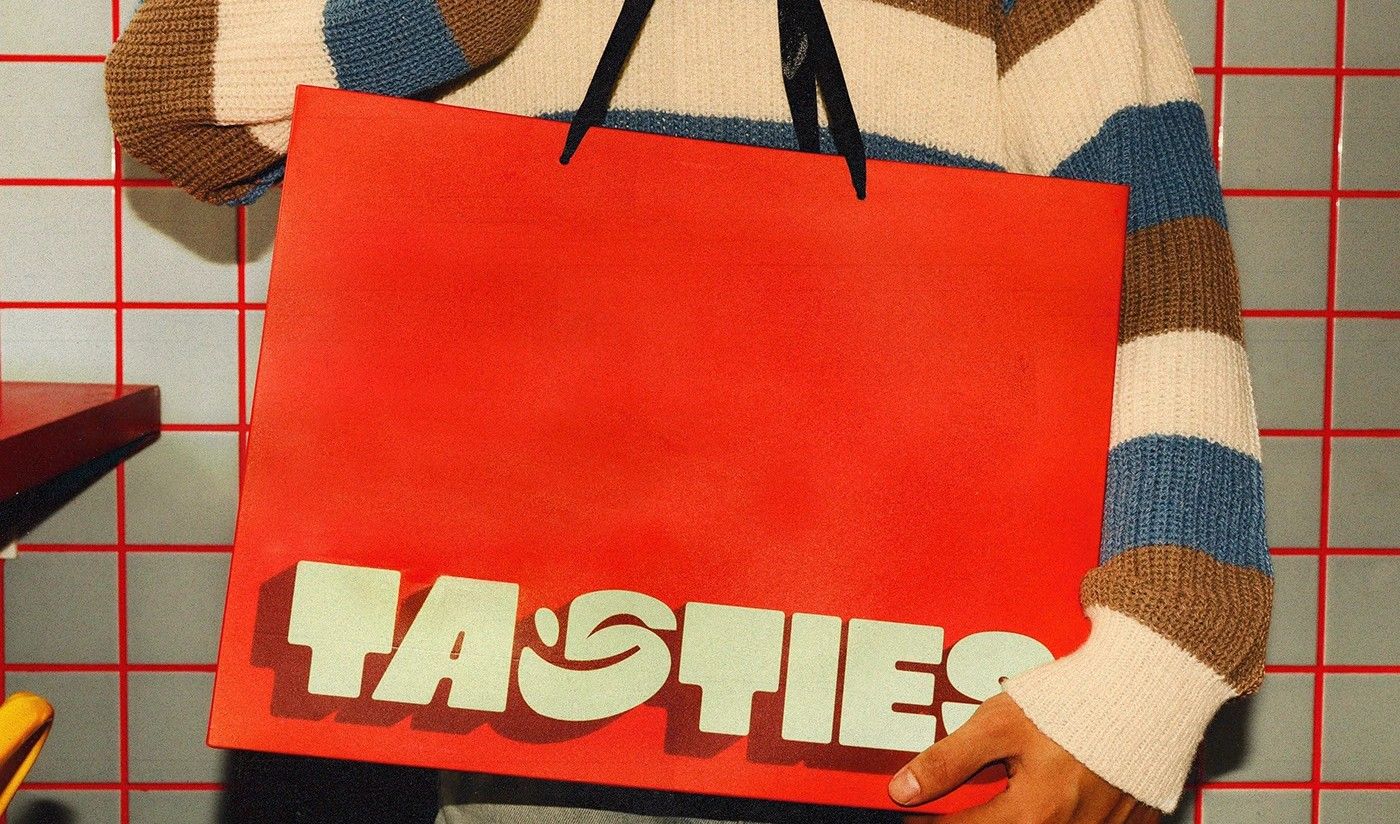
French cereal brand Tasties, created by Huy Hoang and Khanh Khuat, reimagines breakfast with vibrant Retro-Modern design, natural crunch, and storytelling packaging. Each box becomes a collectible artwork, featuring charismatic characters that embody youthful energy, creativity, and adventure, transforming the morning ritual into a colourful universe of inspiration.
Breakfast has long been considered the most important meal of the day, but for Tasties, a new cereal brand from France, it is also the most creative. Conceived by Huy Hoang and Khanh Khuat, Tasties is more than a product—it is a cultural statement, blending nutrition, design, and storytelling into a single, energising experience.
At the heart of Tasties lies a Retro-Modern aesthetic, a style that resonates strongly with European youth culture. This design language, with its bold colours and playful energy, is not simply decoration but a philosophy. Tasties positions itself as a brand that celebrates vibrancy, fun, and unstoppable morning energy, inviting consumers to begin their day with a sense of adventure.

The cereal itself is crafted with a balanced nutritional formula, ensuring that the promise of creativity is matched by substance. The “Exceptional Natural Crunch” is not just a tagline but a carefully developed texture that delivers satisfaction with every bite. French flair is evident in the way taste and health are harmonised, making Tasties a premium offering in a crowded market.
Yet what truly sets Tasties apart is its packaging and identity. Each box is designed as a bold statement, employing Pop Art elements and striking visuals that make it as much a collectible as a container. In an age where branding often stops at the logo, Tasties pushes further, creating what it calls a “Universe of Colour.” This universe is not abstract—it is populated by charismatic characters, each embodying a youthful scenario.
From the adrenaline rush of skateboarding to the relaxed joy of chilling with friends, and the thrill of unboxing a new adventure, these characters transform cereal into narrative. Every box tells a story, and every purchase becomes an entry into a wider imaginative world. For young consumers, this approach resonates deeply, turning breakfast into a ritual of self-expression. For parents, it offers reassurance that creativity and nutrition can coexist.
The strategy reflects a broader trend in branding, where products are no longer judged solely by their functional qualities but by the experiences they create. Tasties understands that in a digital-first age, packaging is not just physical but social. A striking box is Instagram-ready, a character is meme-worthy, and a colourful universe is shareable. By embedding these elements into its DNA, Tasties positions itself as a lifestyle brand rather than a mere food product.
France has long been associated with culinary excellence, but Tasties demonstrates that innovation in food can extend beyond flavour into design and storytelling. It is a reminder that breakfast, often overlooked in the rush of daily life, can be reimagined as a moment of joy, creativity, and connection.
As Tasties prepares to expand its reach, it carries with it the promise of transforming mornings across Europe and beyond. With its fusion of natural crunch, artistic packaging, and narrative-driven identity, it is not just selling cereal—it is selling a colourful, energising start to the day. In doing so, Tasties may well redefine what it means to wake up inspired.
Discover more from Creative Brands Mag
Subscribe to get the latest posts sent to your email.


Leave a comment