

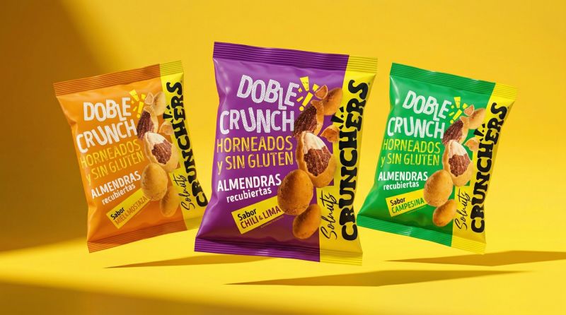
Solnuts introduces a striking new packaging system for its Crunchers range, designed by Hugo Zapata. Combining bold yellow hues, vintage typography, and tactile finishes, the design reimagines premium snack branding, delivering a sensory-led visual identity that challenges category norms and elevates shelf presence.
Solnuts has unveiled a bold new chapter in its brand evolution with the launch of Crunchers, a premium snack range whose packaging design signals a shift from industrial roots to a refined, contemporary visual system. Conceived under the direction of Hugo Zapata, the project goes beyond conventional packaging to create what the designers describe as a “living system” that captures both the sensory and structural essence of the product.
At the heart of the brief was the challenge of translating the brand’s Double Crunch experience—grounded in baking techniques and gluten-free integrity—into a cohesive visual and tactile identity. Rather than simply containing the product, the packaging functions as an extension of it, echoing its texture, intensity, and layered flavour profiles through carefully constructed design elements.
Central to this transformation is the strategic use of yellow, a deliberate departure from the dominant reds that saturate the snack aisle. This chromatic decision creates a distinct “spotlight effect”, ensuring immediate visibility while reinforcing the brand’s heritage links to Sol de Alba. The result is a palette that conveys energy and freshness, positioning Solnuts as both recognisable and disruptive within a crowded category.
Typography plays a crucial role in anchoring the system. Drawing on vintage-inspired letterforms, the design evokes a sense of trust and familiarity without slipping into nostalgia. Instead, the type is energised through graphic tension—fragmentation, halftone patterns, and dynamic textures that visually interpret the crunch itself. These elements introduce rhythm and movement, transforming static packaging into an expressive medium.
The tactile dimension further enhances the experience. Selective finishes, particularly the interplay between matte and gloss varnishes, add depth and contrast, inviting consumers to engage with the packaging beyond sight alone. This material sophistication reinforces the premium positioning of the product while subtly communicating quality and craftsmanship.
Each flavour variant is treated as a distinct narrative within the overarching system. Honey & Mustard balances golden sweetness with sharp, assertive notes, while Savoury Tomato & Onion leans into rustic warmth and culinary familiarity. Chili & Lime delivers a burst of citrus energy tempered by lingering heat, and Cheese offers a rich, comforting intensity designed to resonate with a broad audience. These nuanced interpretations are reflected visually, ensuring that each pack communicates its unique identity while remaining cohesive within the range.
With Crunchers, Solnuts is not merely entering the premium snack segment but actively reshaping its visual language. The design challenges established conventions in consumer packaged goods, where predictability often governs shelf appeal. Instead, it introduces a system that is both flexible and recognisable, capable of evolving with the brand while maintaining a strong core identity.
As competition intensifies in the premium snack market, the importance of design as a differentiating factor continues to grow. Solnuts’ latest move demonstrates how packaging can transcend its functional role to become a strategic asset—one that communicates product quality, enhances sensory perception, and ultimately influences consumer choice.
By breaking away from category norms and embracing a more expressive, system-driven approach, Solnuts Crunchers positions itself as a benchmark in contemporary snack branding, setting a new standard for how design can elevate everyday products into compelling brand experiences.
Discover more from Creative Brands Mag
Subscribe to get the latest posts sent to your email.


Leave a comment