

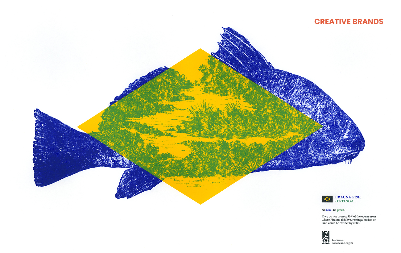
Droga5 São Paulo has unveiled the second phase of its “No Blue, No Green” campaign for SOS Oceano, transforming the symbolism of the Brazilian flag into a series of handcrafted screen prints. The initiative highlights the interdependence between oceans and forests while combining environmental advocacy with sustainable artistic production.
Award-winning creative agency Droga5 São Paulo has launched the second phase of its “No Blue, No Green” campaign for SOS Oceano, expanding a striking environmental message into a handcrafted artistic statement that spotlights the fragile relationship between marine and terrestrial ecosystems.
Originally unveiled during Rio Ocean Week in October 2025, the campaign gained attention for its provocative reimagining of the Brazilian flag, stripping away its iconic blue and green colours to demonstrate the dependency between oceanic and land-based life. The message was intentionally direct: without the blue of the oceans, there can be no green on land.
The newly announced second phase transforms that conceptual approach into a tactile collection of six limited-edition screen-printed artworks. Developed in collaboration with Black Madre Studio and Joules & Joules Laboratory, the pieces use natural mineral pigments to create vivid depictions of Brazilian biodiversity, pairing marine and terrestrial flora and fauna in compositions inspired by the visual language of Brazilian naturalist illustration.


From imagery of the Amazon rainforest to the humpback whale, the series seeks to emphasise ecological interconnectedness through both symbolism and materiality. The yellow diamond at the centre of the Brazilian flag remains visually prominent in each work, representing the fusion of the removed blue and green hues and reinforcing the idea that one biome cannot survive without the other.
Diego Limberti, Chief Design Officer at Droga5 São Paulo, said the campaign aimed to transform a complex environmental issue into an emotionally resonant visual experience. He noted that while the first phase relied on absence to convey urgency, the new artworks reinterpret the colours and symbols of the national flag to highlight the interdependence between marine parks and forests.
The production process itself was carefully aligned with the campaign’s environmental principles. Screen printing was selected for its ability to deliver chromatic precision and layered textures while maintaining the authenticity associated with artisanal graphic traditions. Extensive experimentation was conducted to develop natural pigments capable of achieving the desired tones and transparency without relying on synthetic solvents.
André Maciel, Creative Director at Black Madre Studio, explained that the project was grounded in colour theory as much as environmental advocacy. The campaign’s central idea — that blue and yellow combine to create green — was intended to function simultaneously as a scientific truth and a metaphor for ecological balance.
The initiative was also developed alongside WALK, the impact innovation hub within Droga5 São Paulo, which focuses on integrating social impact, cultural insight and brand reputation into communication strategies. Using proprietary methodologies and impact measurement tools, the division aims to help brands engage more meaningfully with contemporary social and environmental issues.
Formerly known as Soko, Droga5 São Paulo has built a reputation for generating culturally driven campaigns that blend creativity with public conversation. Now part of the wider global Droga5 network, the agency operates alongside offices in cities including New York, London, Tokyo and Sydney. In 2025, it secured its first Cannes Lions Grand Prix and continued a run of recognition across international advertising festivals, including The One Show, Clio, Effie and El Ojo Awards.
Discover more from Creative Brands Mag
Subscribe to get the latest posts sent to your email.


Leave a comment