

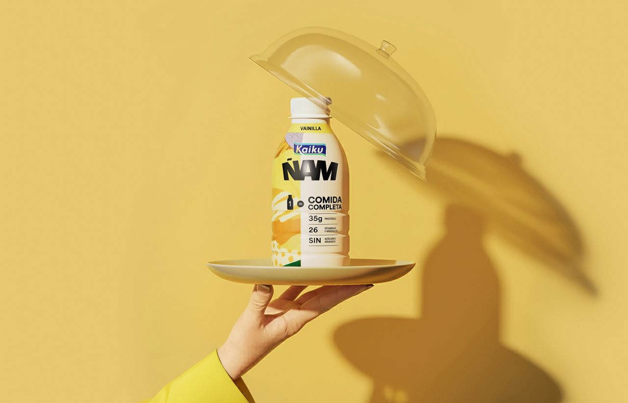
TSMGO introduces Kaiku Ñam, a 500 ml dairy drink delivering the nutrition of a full meal in one bottle. With bold packaging, vibrant colours, and clear benefit cues, it redefines convenience and challenges traditional dairy codes—offering a modern, aspirational solution for Spain’s fast-paced, health-conscious consumers.
TSMGO has unveiled Kaiku Ñam, a disruptive dairy drink designed to redefine convenience and nutrition in Spain. Positioned as neither yoghurt nor protein shake, Kaiku Ñam delivers the nutritional value of a full meal in a 500 ml format, balancing starter, main, and dessert in one streamlined solution. Built for people who see well-being as a choice rather than a compromise, it offers a practical answer to fast-paced lifestyles where sitting down to eat is not always possible.
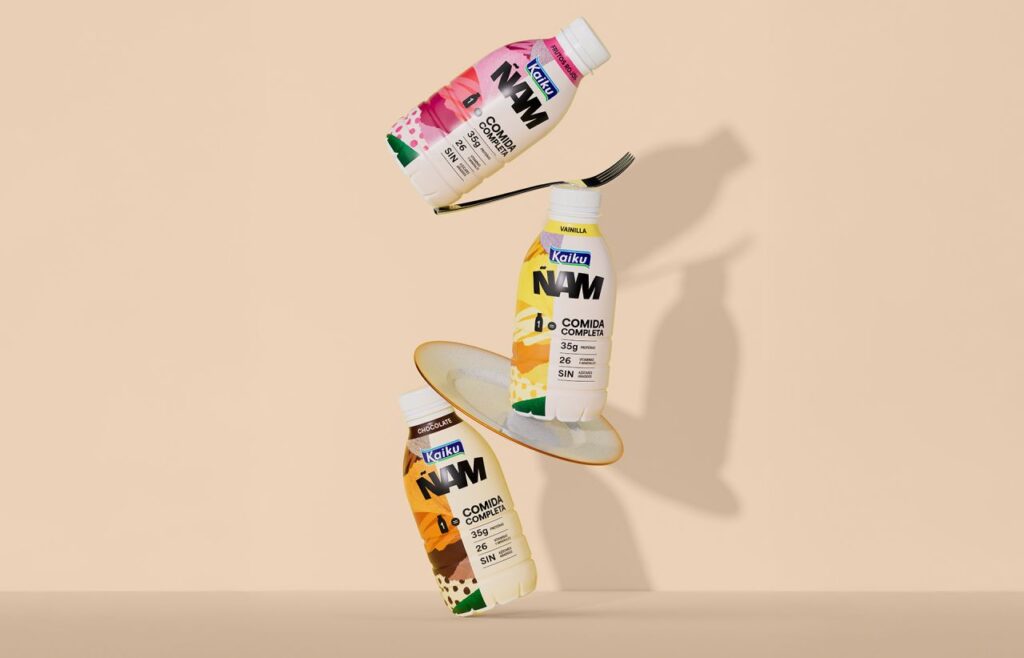
The brand’s ambition is clear: to own the ready-to-drink complete meal category, much as Kaiku did with lactose-free products. The message is simple and direct—“1 bottle = 1 complete meal”—anchored by transparent benefit cues such as 38g protein, 26 vitamins and minerals, and no added sugar. This clarity is reinforced by a bold creative approach that breaks away from the soft, pastel codes of traditional dairy branding. Instead, Kaiku Ñam embraces tension, geometry, and precision, creating a stripped-back system that feels controlled, energetic, and purposeful.
The packaging system is built on three pillars: distinctive lettering that integrates the Ñam logotype with the Kaiku masterbrand, a vibrant dual colour palette that differentiates flavours while projecting energy, and structured information that organises and prioritises benefits for instant comprehension. The result is a design that is solid, dense, and unmistakably present—mirroring the product’s promise of a complete meal.
With a matte finish and confident colour blocking, Kaiku Ñam’s bottles are designed for life on the move. Saturated colours and sharp contrasts ensure immediate shelf impact, enabling fast identification and strong recall in a crowded marketplace. By merging nutritional performance with aspirational identity, Kaiku Ñam positions itself as a modern, effective solution for consumers who demand both function and desire.
Discover more from Creative Brands Mag
Subscribe to get the latest posts sent to your email.


Leave a comment