


A Northeast Indian craft gin has won the Red Dot Award 2026 for Product Design — a category historically ruled by automobiles, medical devices, and consumer electronics. The recognition singles out the brand’s stainless-steel bottle and its built-in measuring closure, which together reframe the gin vessel as a precision tool rather than mere packaging.
When the organisers of the Red Dot Award announced their 2026 winners for Product Design, the company they kept was familiar: Apple, Sony, Ferrari and Philips have all graced the list over the decades since the prize was established in 1954. What was rather less familiar was a craft gin from the foothills of Northeast India sitting amongst them.
Cherrapunji Eastern Craft Gin has become one of the rare spirits brands to receive the Red Dot Award: Product Design, in a competition that evaluates thousands of entries annually across more than fifty categories. For an industry accustomed to measuring prestige in blind tastings and distillery medals, the honour arrives from an unexpected quarter — and for reasons that have nothing to do with what is inside the bottle.
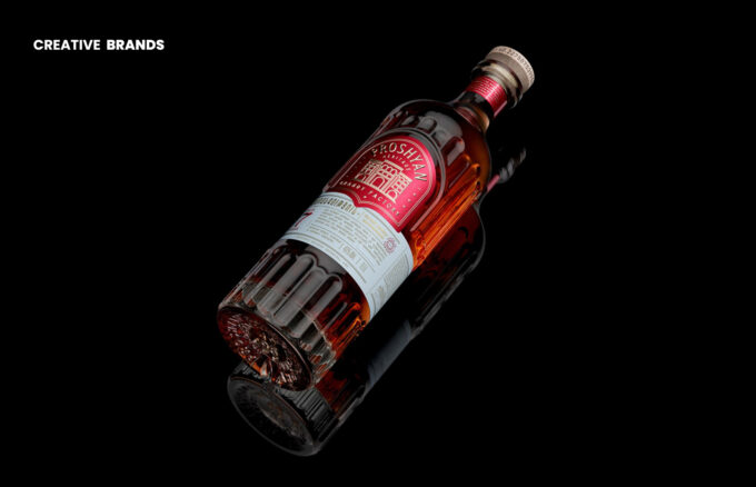
It is the bottle itself that caught the judges’ attention.
Where most premium spirits lean on heavy glass, embossed lettering, and wax seals to communicate quality, Cherrapunji took a more utilitarian turn. The vessel is constructed from SS304 stainless steel, a grade commonly associated with surgical instruments and kitchen equipment, chosen here for its durability and capacity for repeated use. The material resists breakage, withstands temperature variation, and is infinitely reusable — considerations that sit well in an era of growing scrutiny over single-use packaging in the drinks industry.
Yet the more striking innovation is embedded in the closure. The cap incorporates a measuring system that functions as a built-in jigger, calibrated for precise pours of 30 ml and 60 ml — the standard measures for a single and double shot respectively. The sequence is collapsed into a single action: open, measure, pour. The separate jigger, that small hourglass-shaped implement rattling around in countless home bars, is rendered redundant.
It is a deceptively simple idea, and simplicity of that order tends to be harder to achieve than it looks. The Red Dot jury, in recognising the gin, cited clarity of function, efficiency of interaction, and the seamless integration of form and utility — language that would not look out of place in an assessment of a precision instrument or a well-engineered kitchen appliance.
The bottle’s visual identity does nod to its origins. Cherrapunji, the town in Meghalaya after which the gin is named, is one of the wettest places on earth, a landscape defined by extraordinary rainfall, cloud forest, and the living root bridges woven by the Khasi people over centuries. The design draws on the culture and topography of the Northeast — a region that has historically occupied the margins of mainstream Indian consumer culture but which has, in recent years, become a source of significant creative and gastronomic energy.
That cultural reference, however, was not what won the award. The Red Dot recognition is an industrial design prize, and it rewarded the gin on industrial design terms: a product that solves a problem, integrates its solution invisibly into the object’s form, and does so without sacrificing the object’s identity. In that sense, the Cherrapunji bottle is less a piece of spirits packaging that has wandered into the wrong prize category and more a designed object that happens to contain gin.
For a competition long associated with the clean lines of consumer electronics and the engineered precision of automotive design, that distinction matters. It suggests that the boundaries between craft beverage culture and serious product design are rather more porous than either industry tends to acknowledge.
Whether the award translates into commercial momentum remains to be seen. But for a gin brand from one of the remotest corners of the subcontinent, earning a place in a lineage that includes Ferrari and Bose — on the strength of a bottle cap — is, at the very least, a remarkable opening statement.
Discover more from Creative Brands Mag
Subscribe to get the latest posts sent to your email.


Leave a comment